GalleryPal
Overview
Being immersed in the artwork at a museum requires more than the naked eye. One must be knowledgeable about the art, the craft, the artist, and so much more, while being careful not to be taken out of the viewing experience.
Through a real-life scenario prompt, my task was to conduct a design sprint to create a solution to enhancing the overall experience for museum visitors.
Timeline
1 week
Role
Product Designer
Tools
Figma
Mockups (Wireframes)
Miro
Challenge
GalleryPal, a startup, wants to enhance the experience of in-person art viewing in a museum or gallery to increase customer satisfaction.
Constraints
While placing business goals and targeted users at the forefront of my process, there was a time-constraint of completing the design sprint in one week, independently.
My goal for the Day 1 Design Sprint was to gather as much information as I could to try to understand the main problems museum visitors were facing.
Following an in-depth analysis of 7 user interviews and gaining valuable insights into the tour guides' aspirations for enriching visitor experiences, the following pain points emerged among users:
Visitors are given too much information on artwork, which keeps them on their phone, and it takes them away from the experience.
Visitors don’t know the context or technique of the artwork they are currently viewing.
Certain visitors express a dilemma, desiring both the guidance of a tour guide and the freedom to explore independently.
Persona
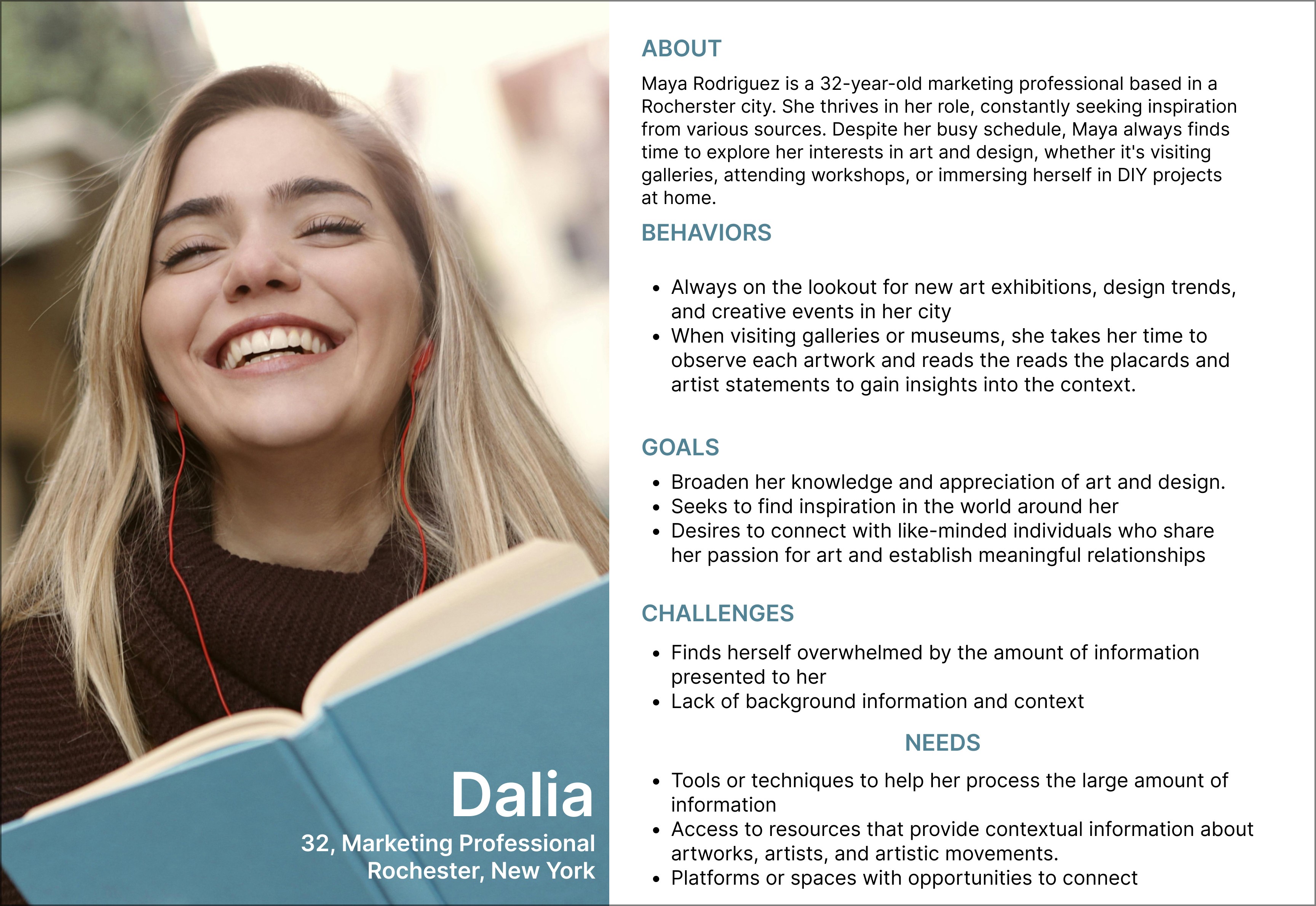
Dalia spends her free time going to museums and sharing her thoughts on art with her like-minded friends, but she finds it hard to understand art when she has no context to build off on.
Given all of the insights found from reviewing interviews, Dalia represents the ideal user for GalleryPal and was taken into consideration with every step of the design process. Without Dalia in mind, it would have been difficult to remember who I was designing for.
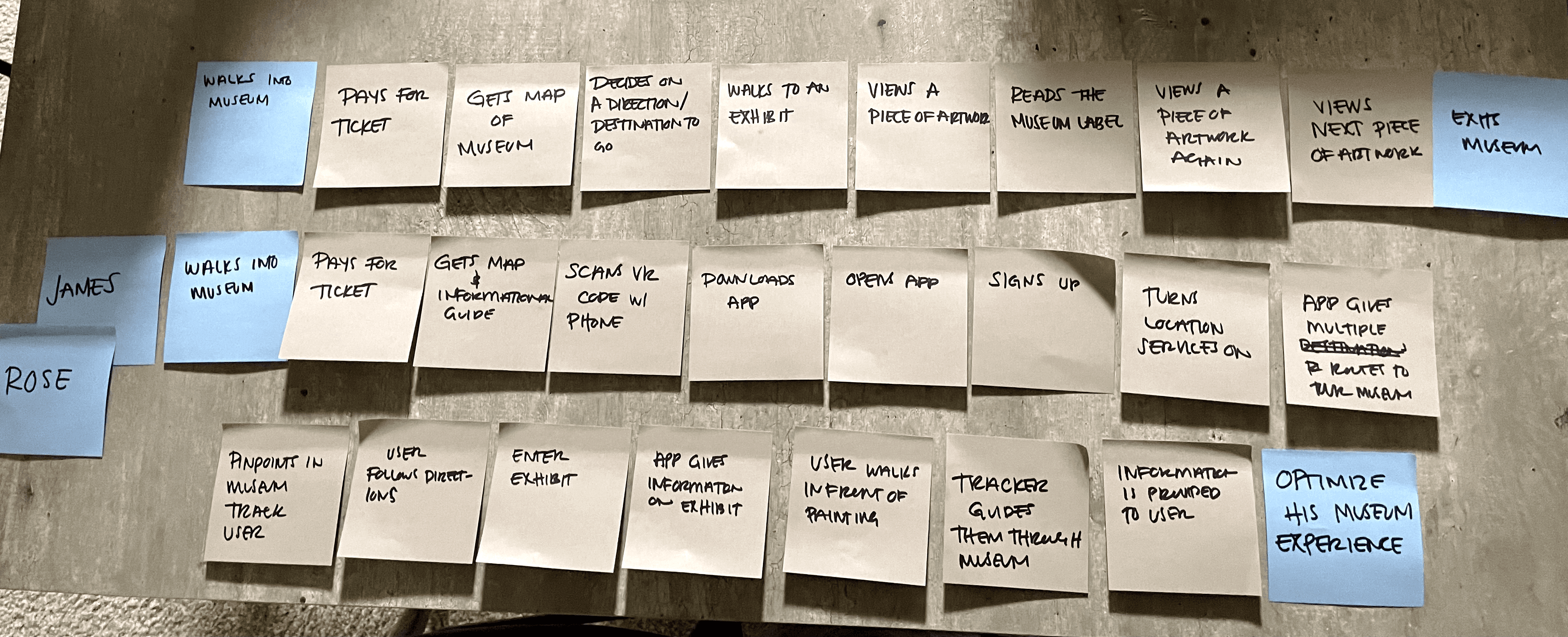
Mapping
Lightening Demos
To figure out what other apps did well that might inform the design decisions for the solution, I grabbed ideas from the following:
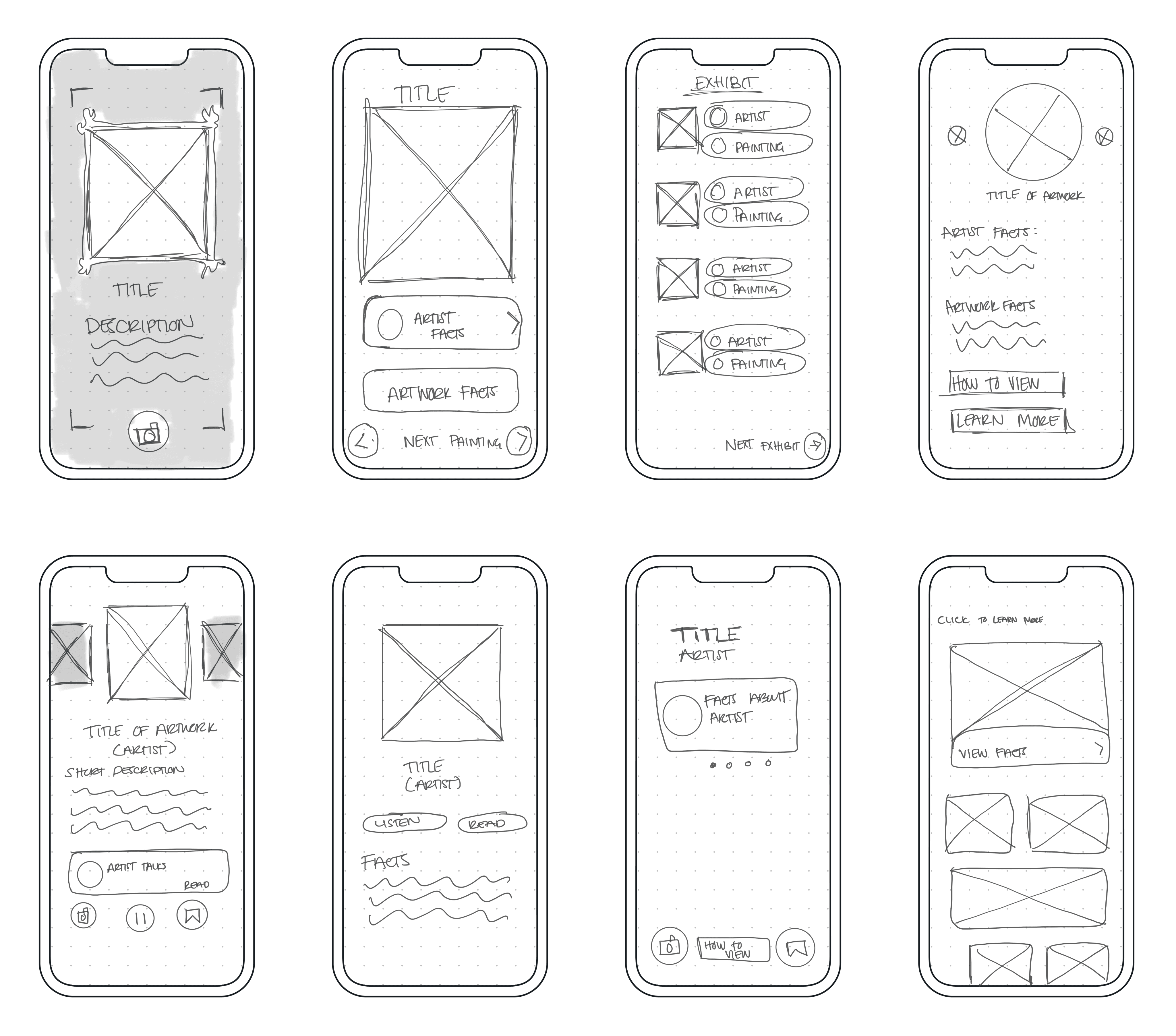
Crazy Eights
Critical Screens
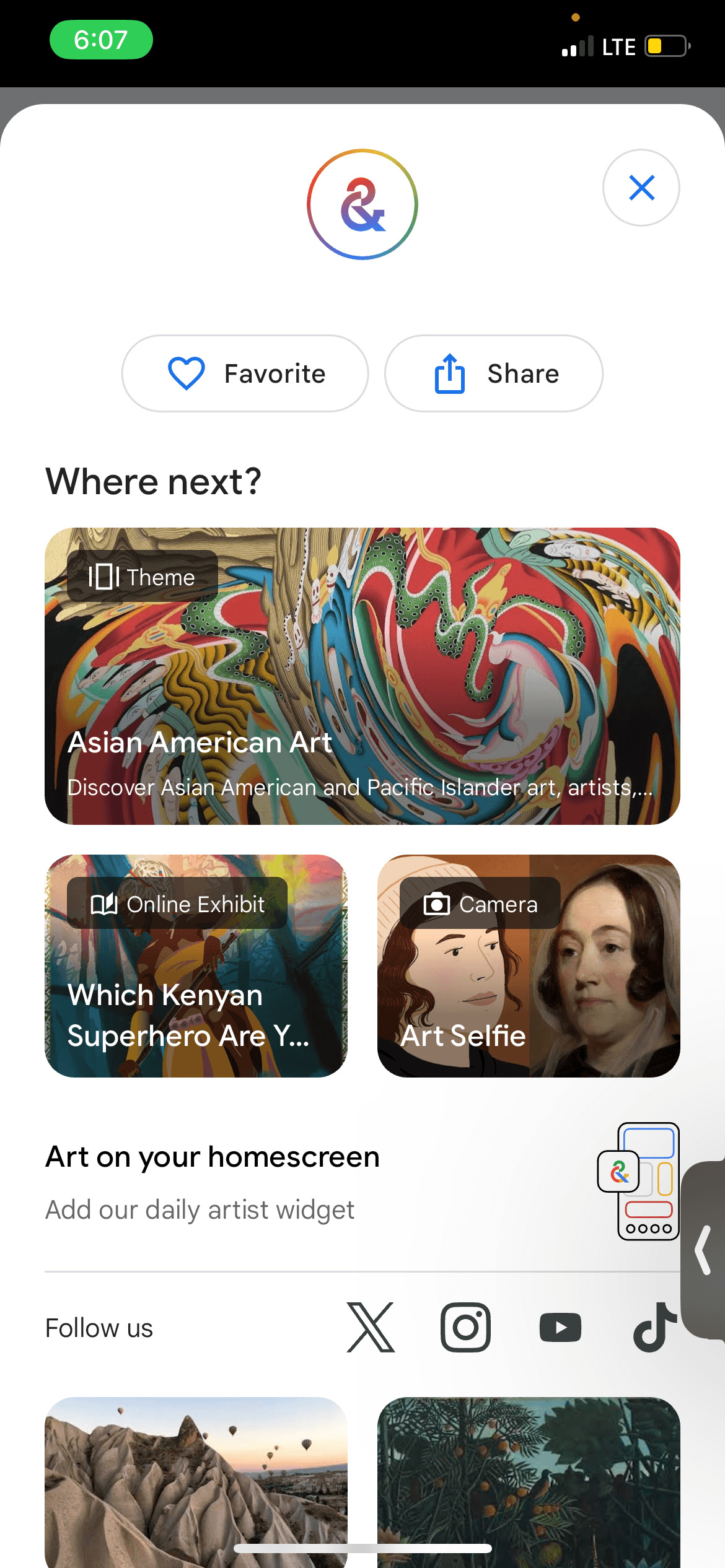
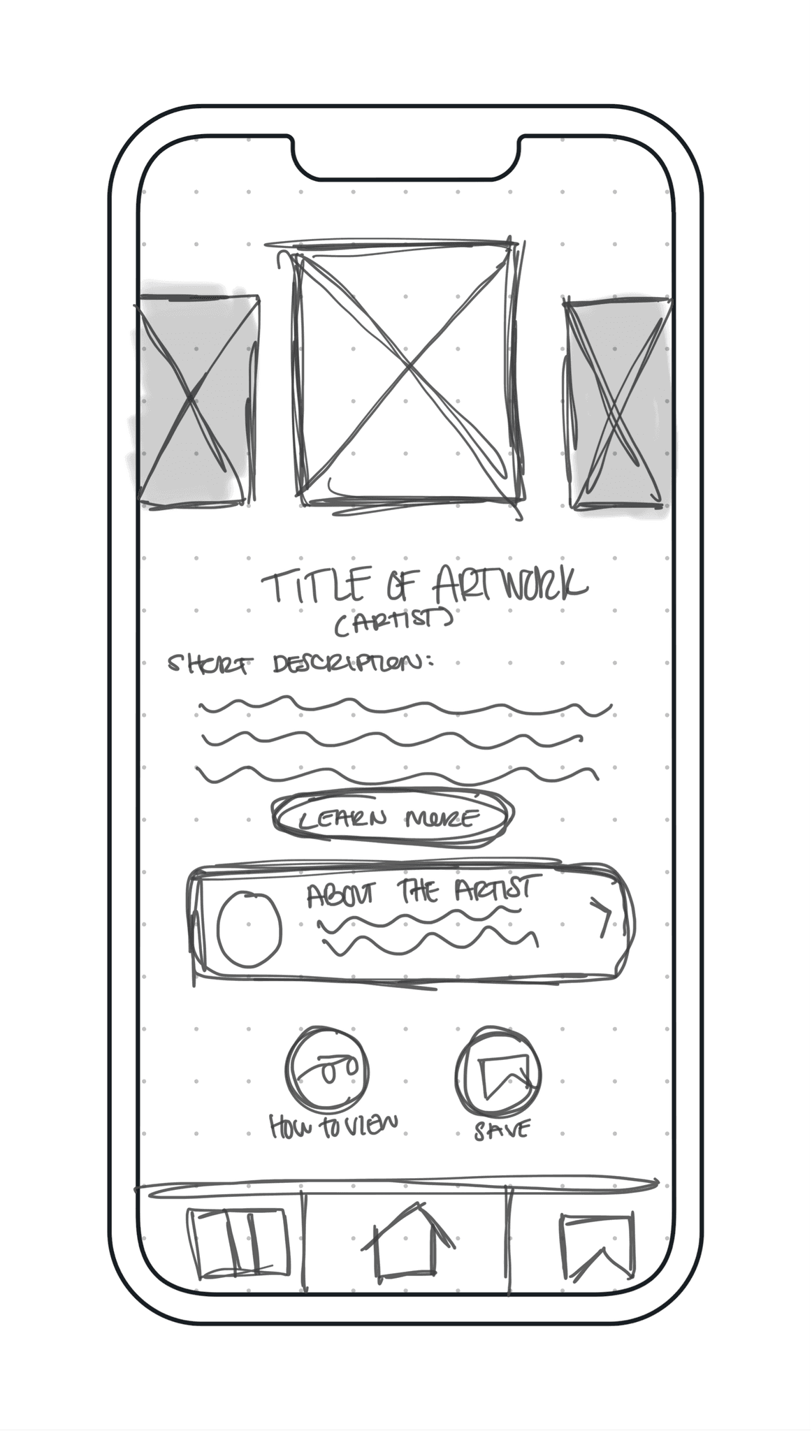
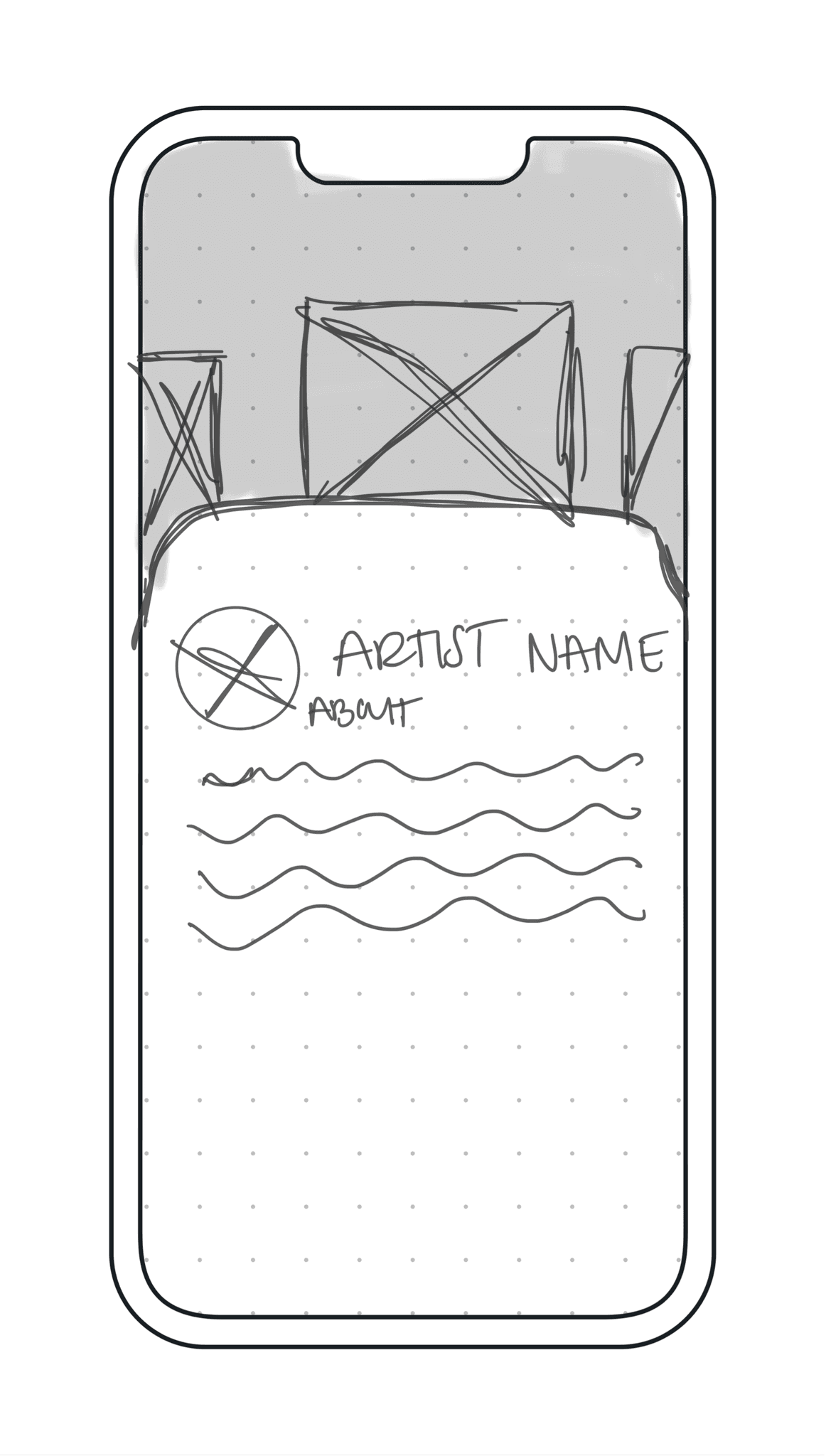
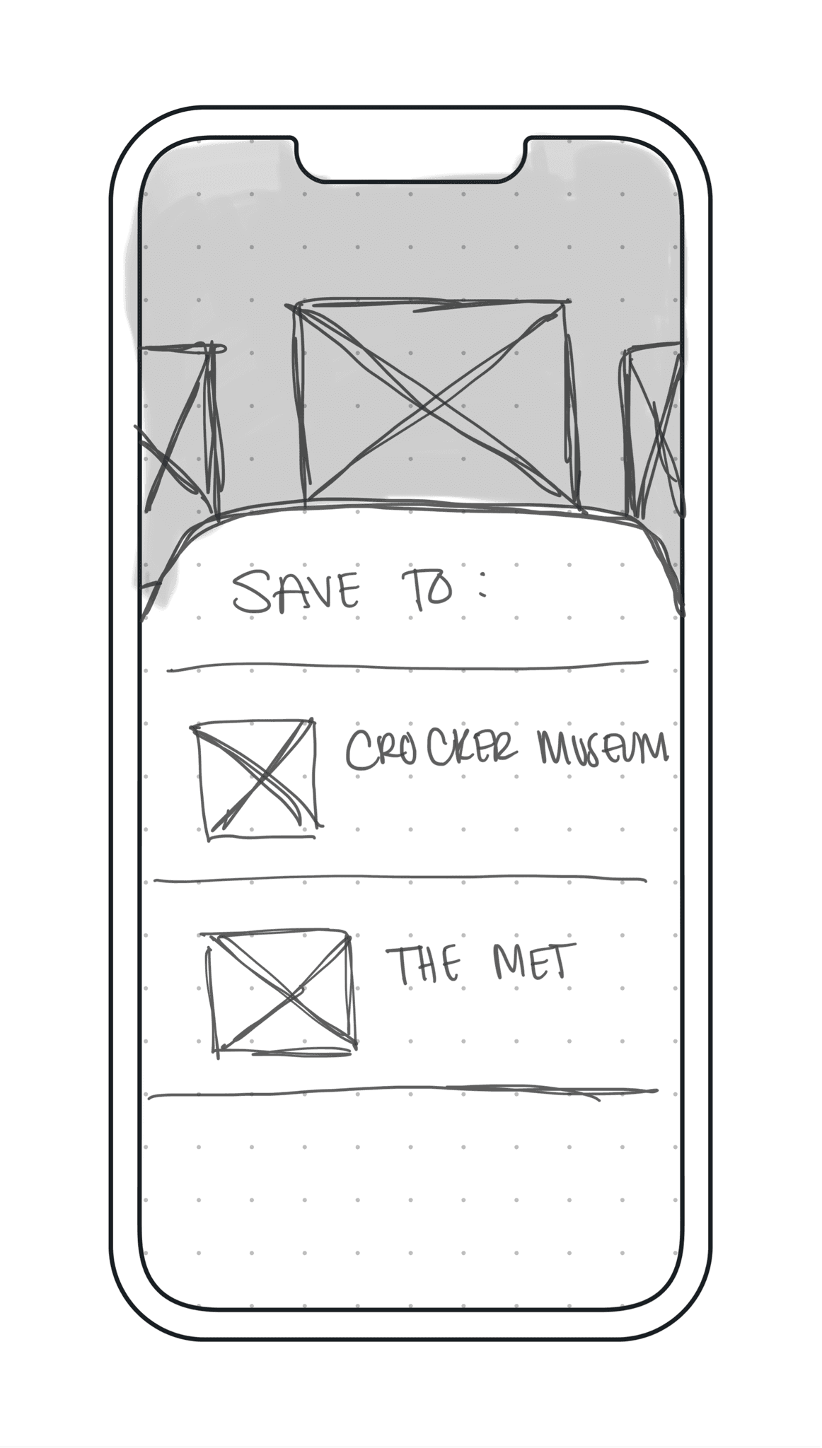
These critical screen were essential to meet the needs and goals of the museum visitors, while also taking into consideration pain points:
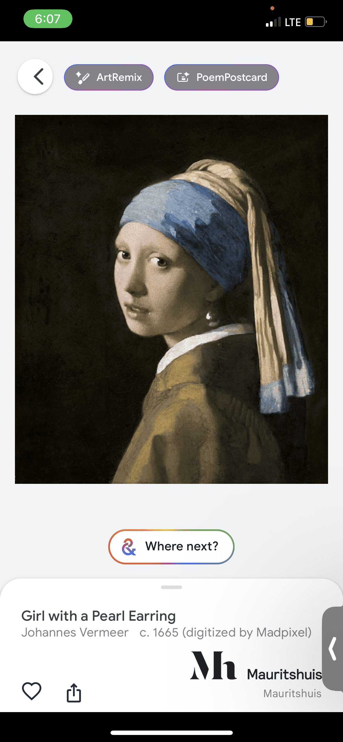
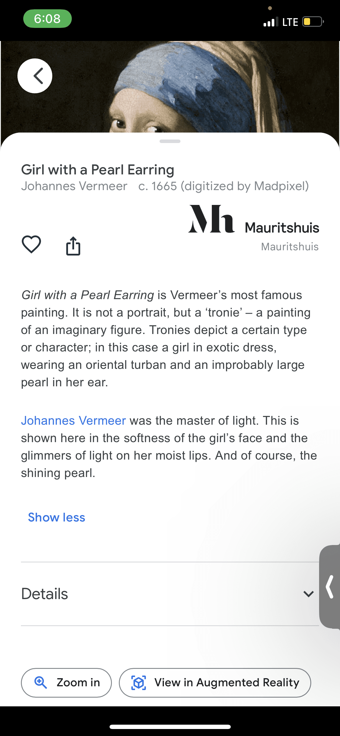
Having context on the artwork
Getting information on the artist
Staying within the museum experience
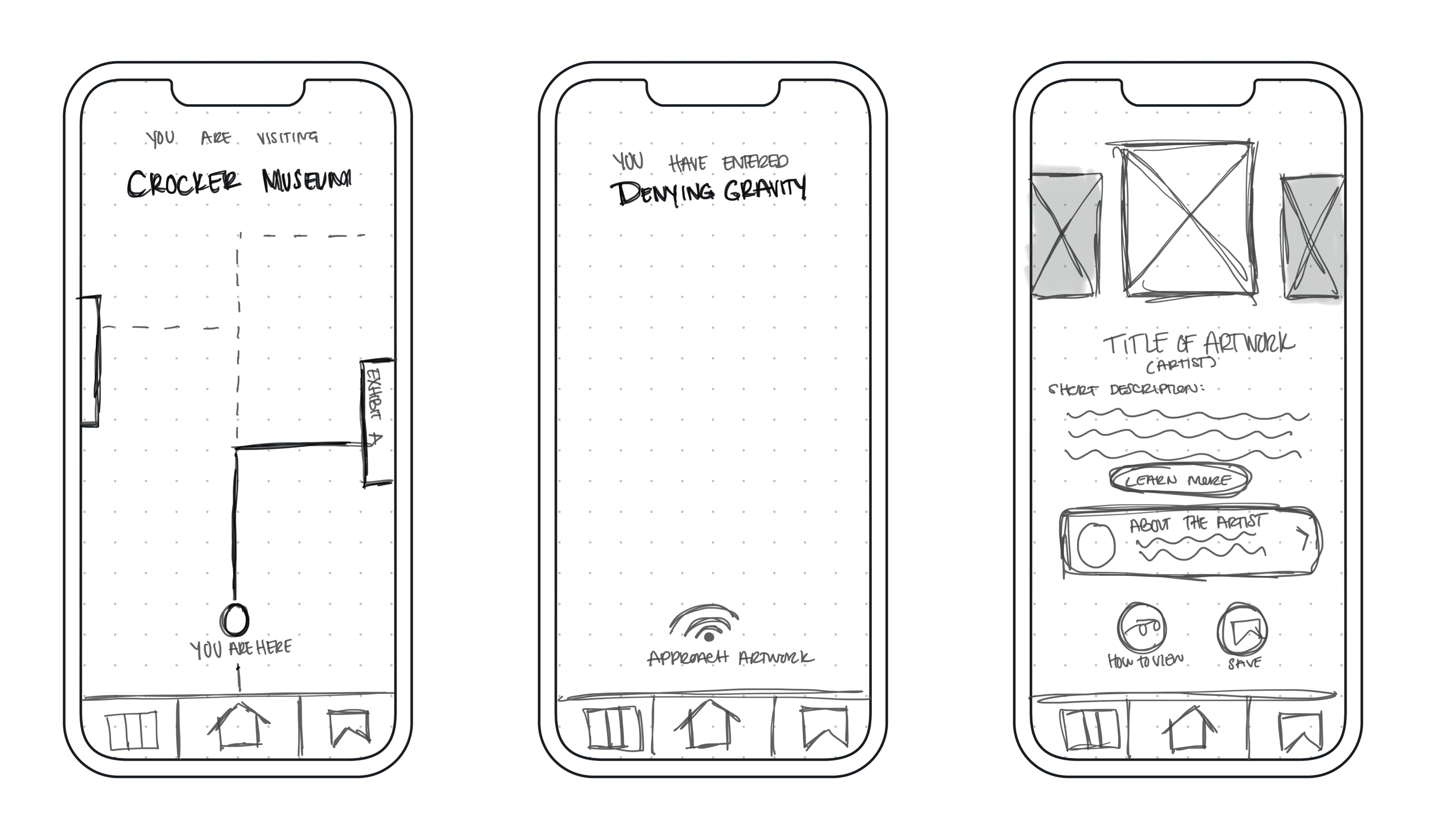
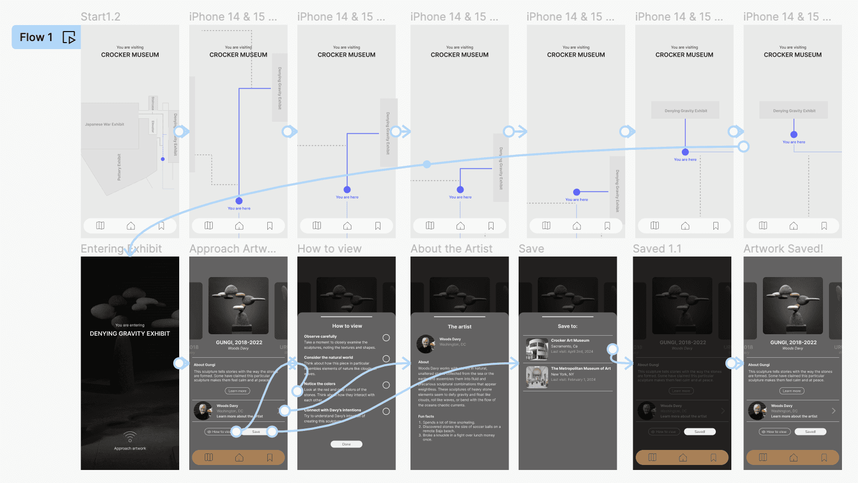
The storyboards helped with understanding how Dalia would interact with the app.
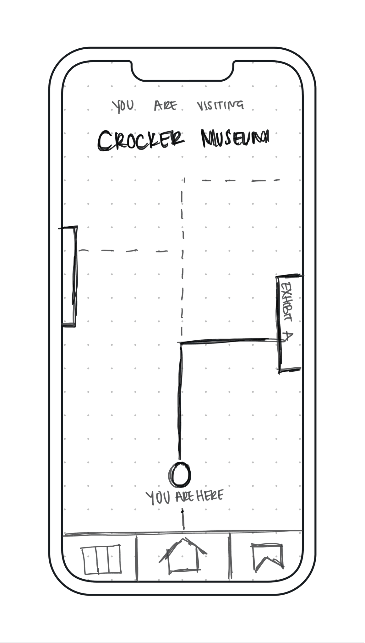
User clicks on desired route
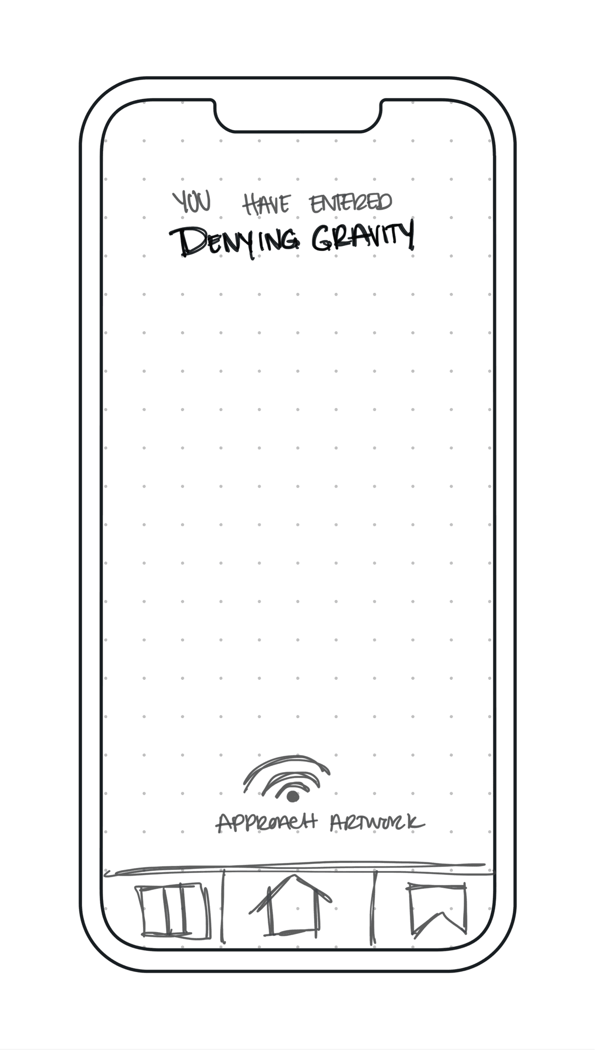
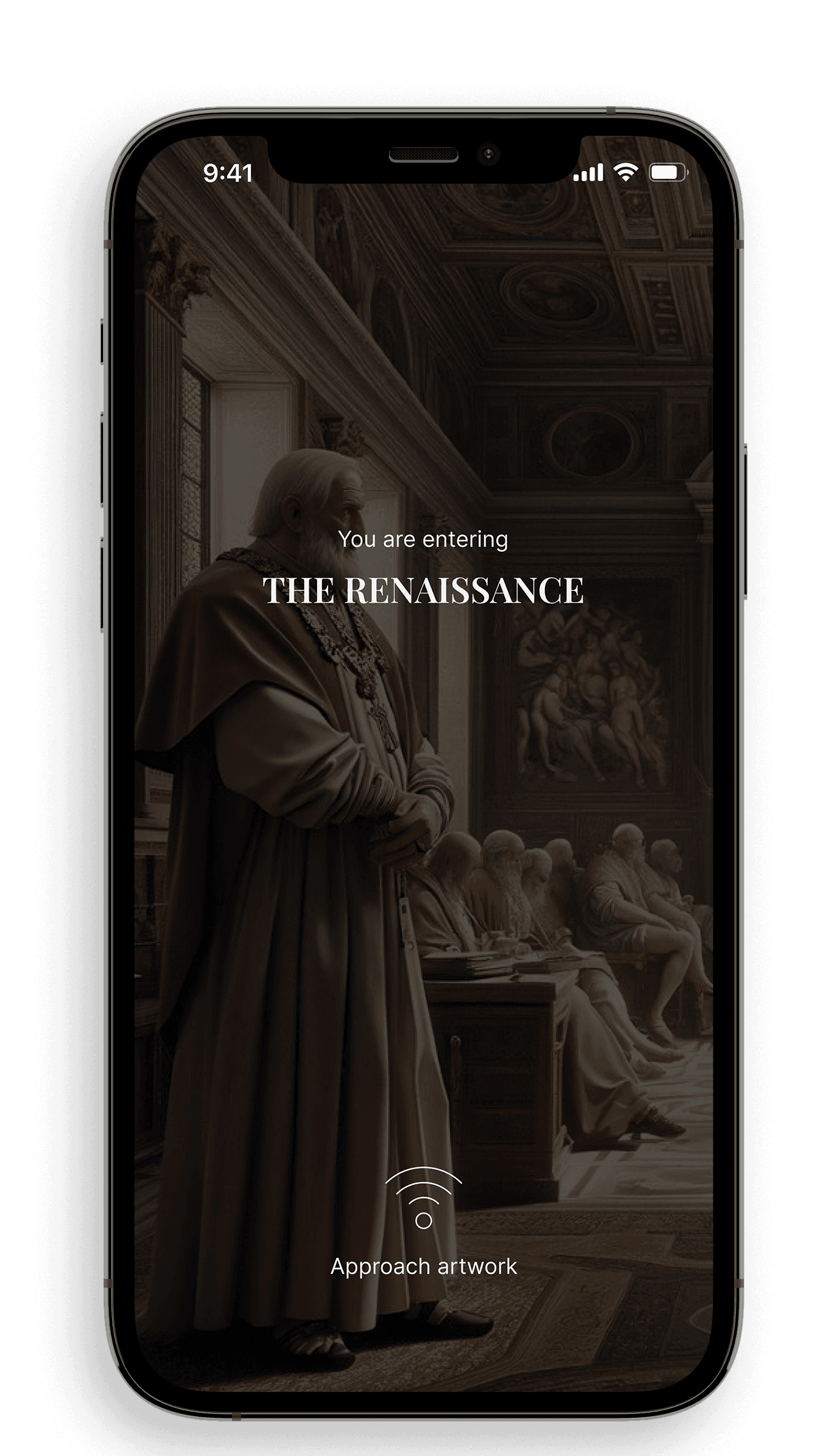
Entry screen appears to inform user that they have entered an exhibit
User follows direction at bottom to approach artwork
User gets information on the artwork they are in front of
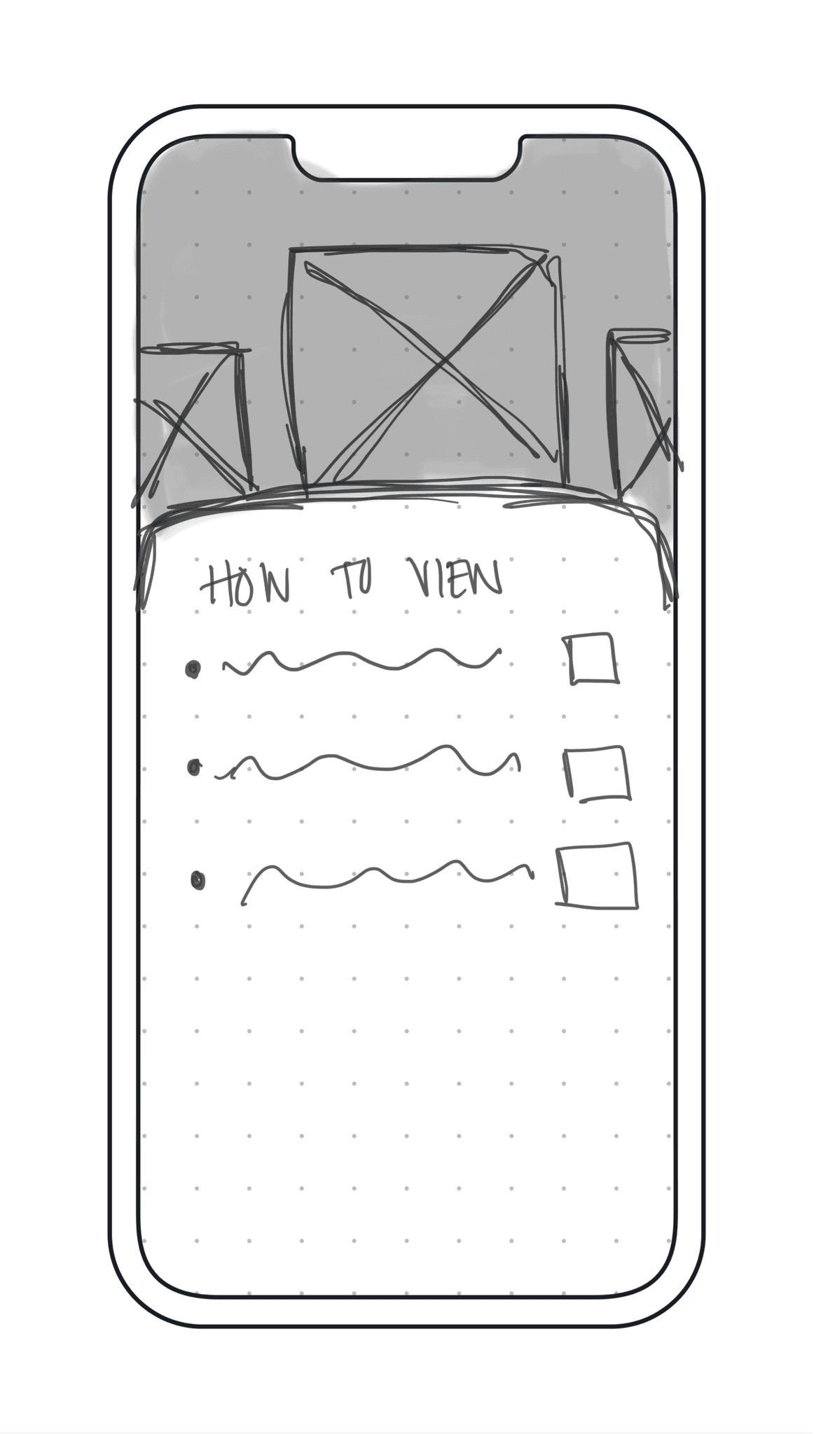
User clicks on how to view, follows direction, looks at artwork, checks the boxes, and then proceeds to the next step
User clicks on about the artist and reads information
User saves the artwork to the current museum they are at
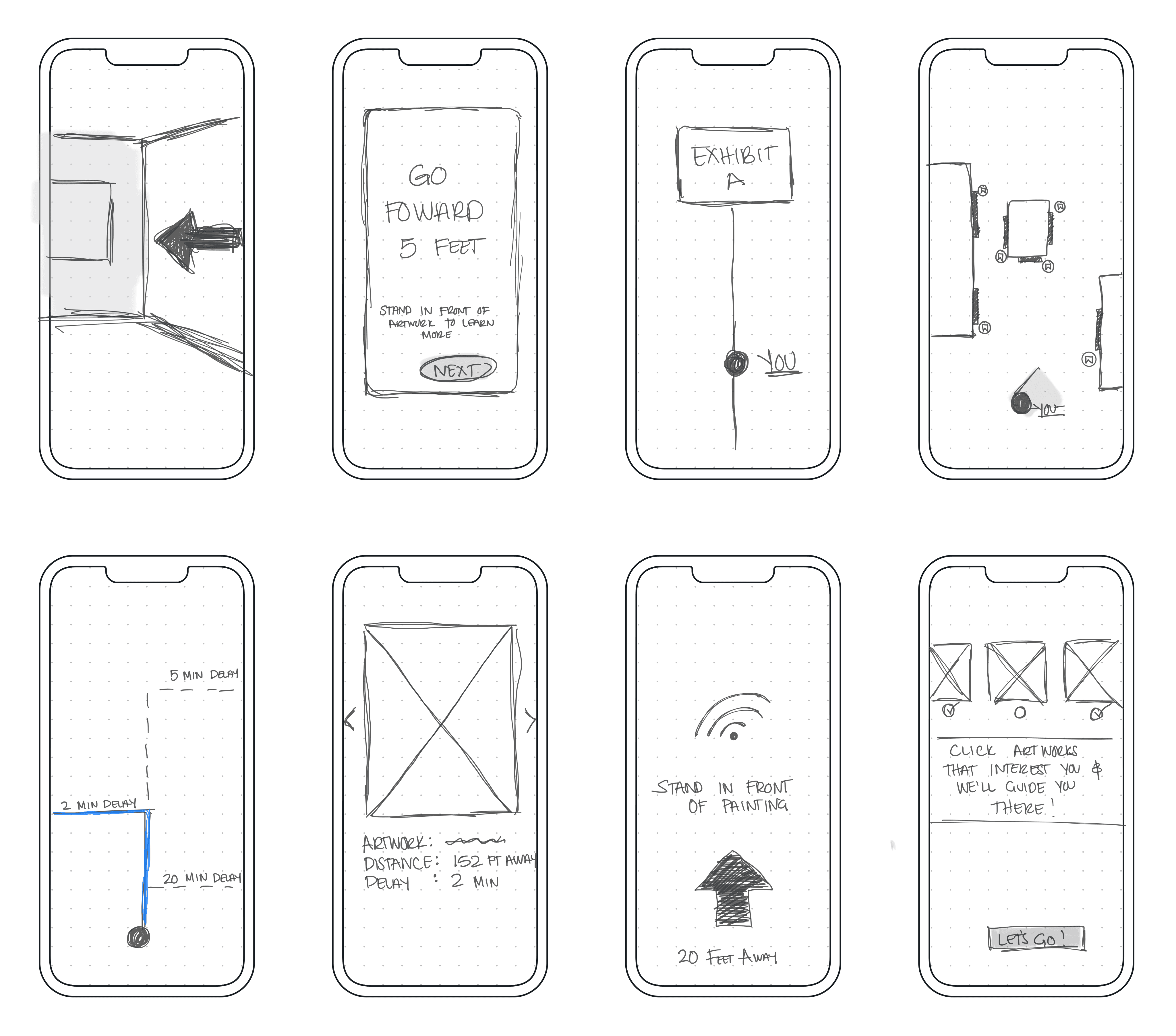
In order for the participants to understand they were walking through the museum, I had to design additional screens to really give them the experience of doing so.
Testing the prototype with 5 participants made success and failure tasks clear.
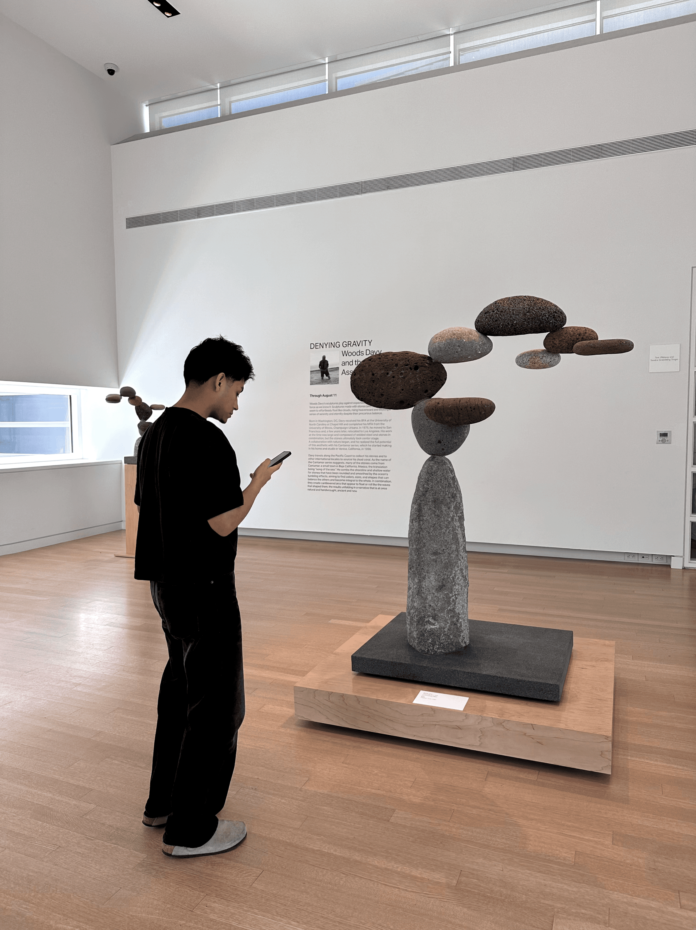
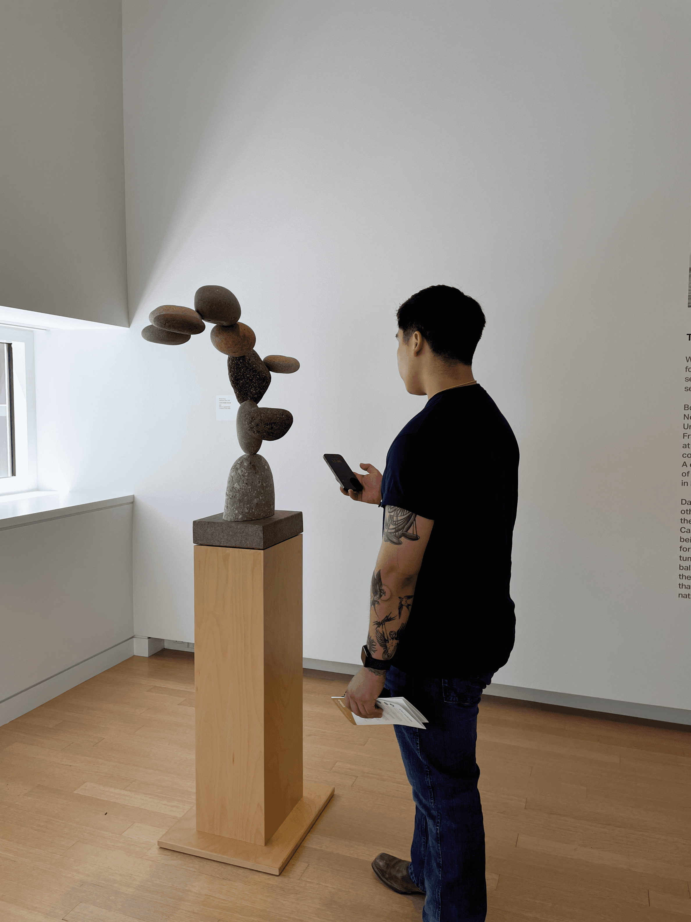
I then met with participants at the Crocker Museum in Sacramento, California where the exhibit was and conducted a full moderated usability test.
What Worked:
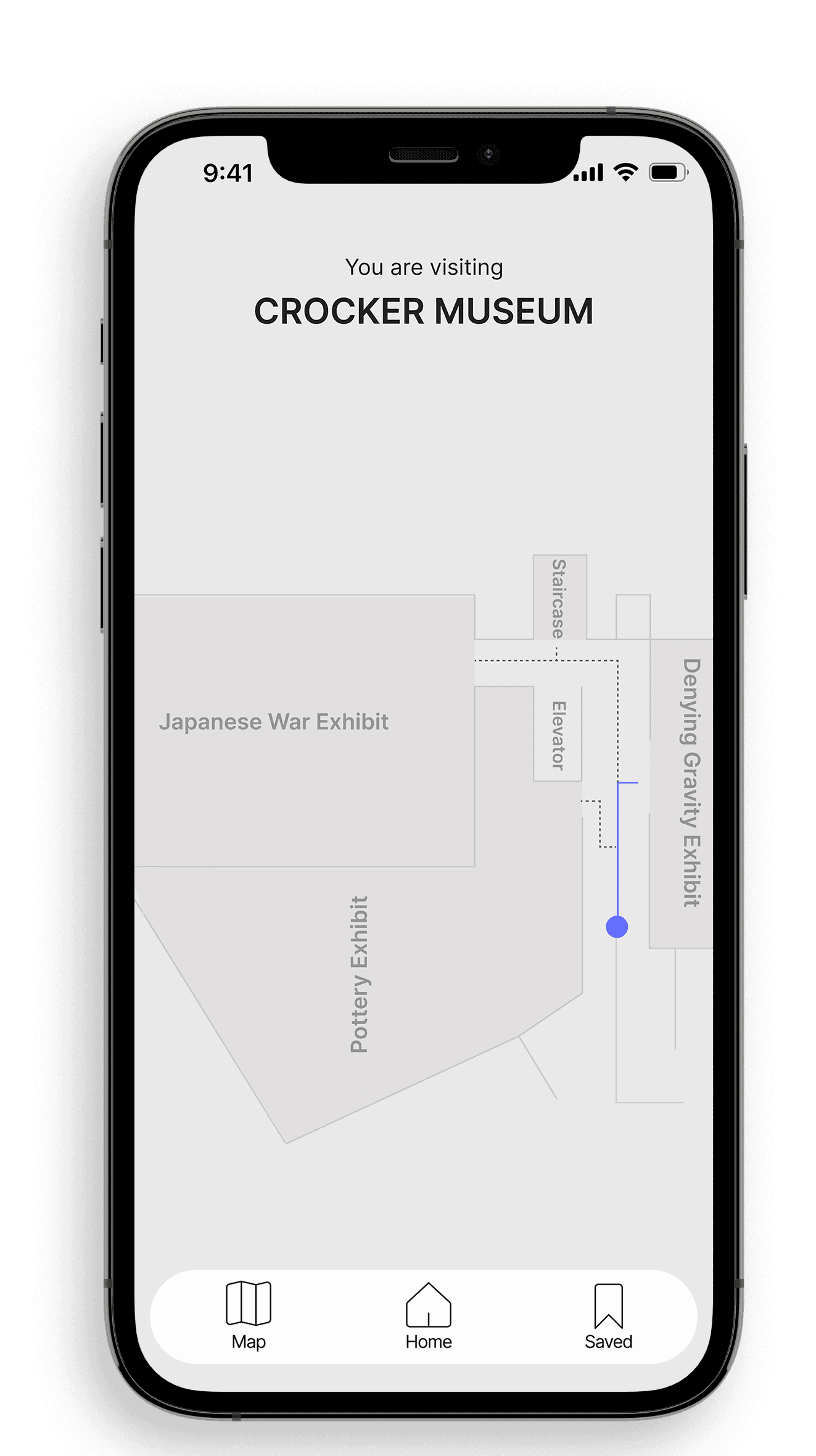
Users understood they were walking through the museum
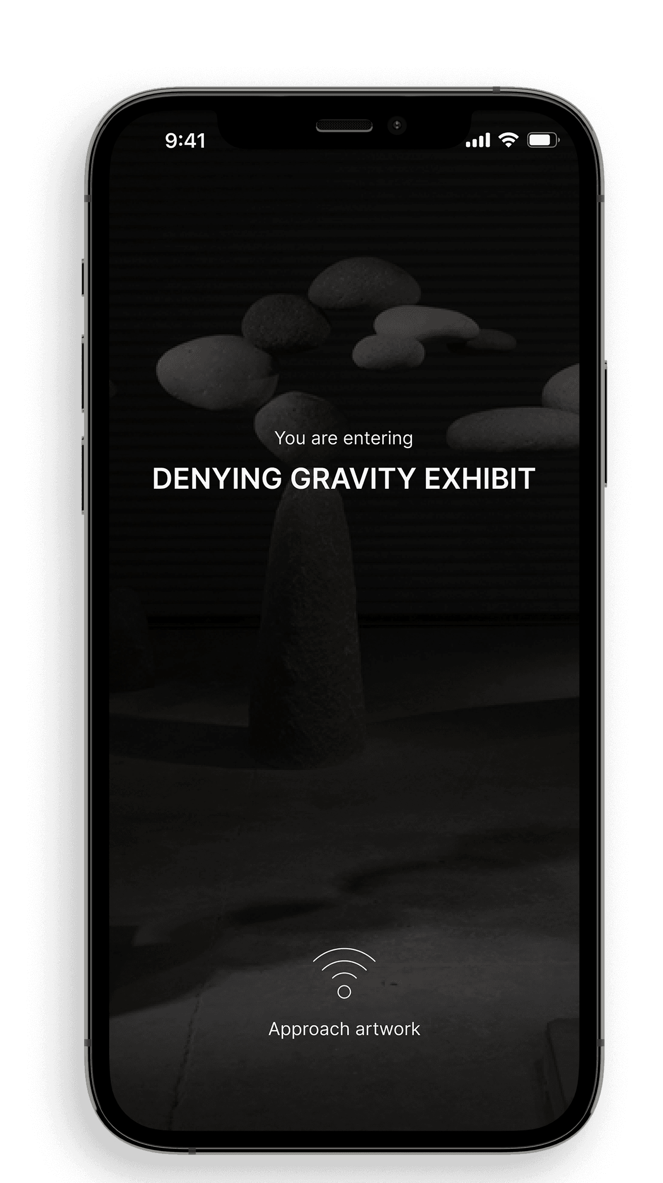
User loved how interactive their experience was
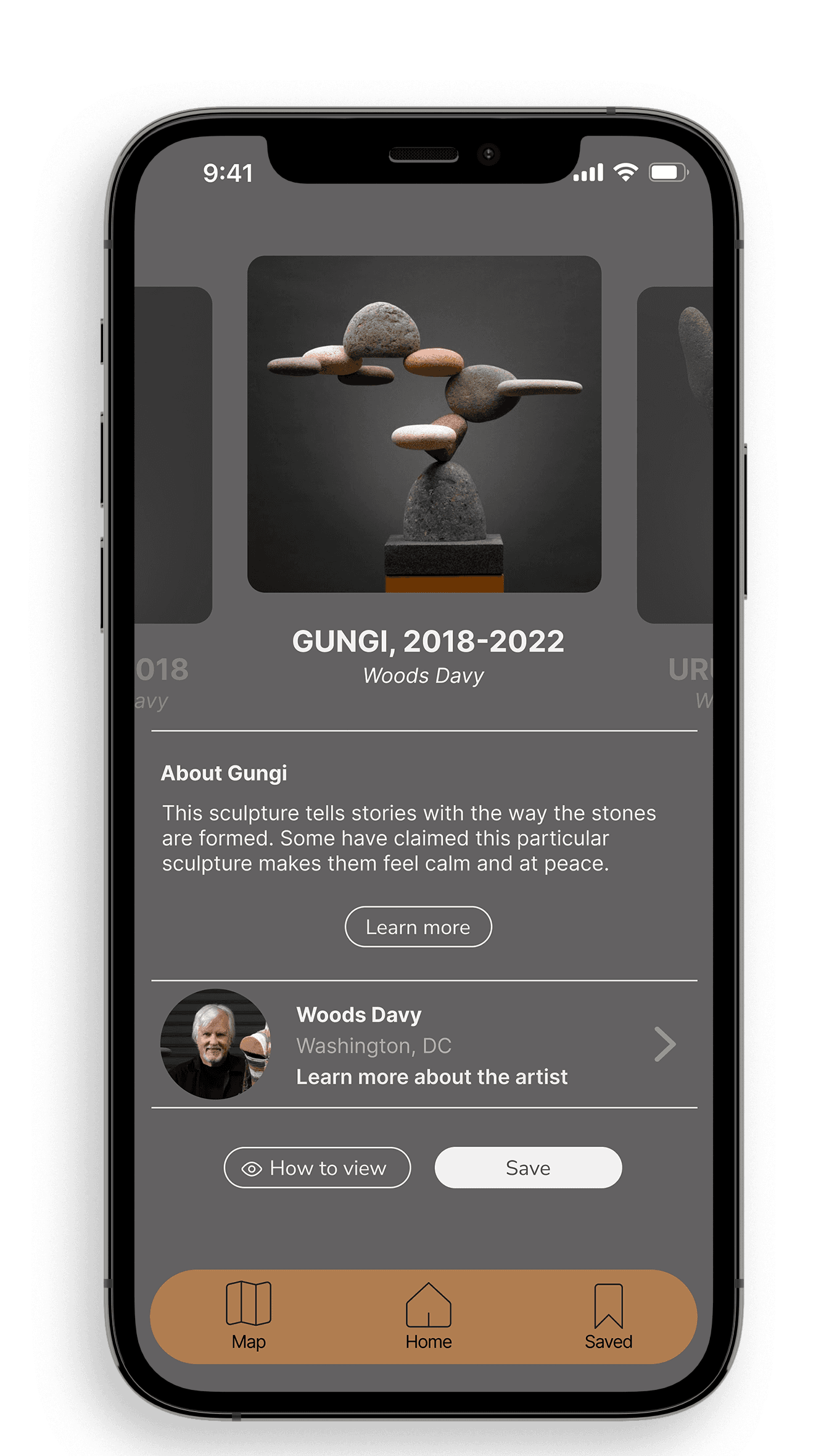
Users liked the idea of having a collection of their saved memories at the museum they visited
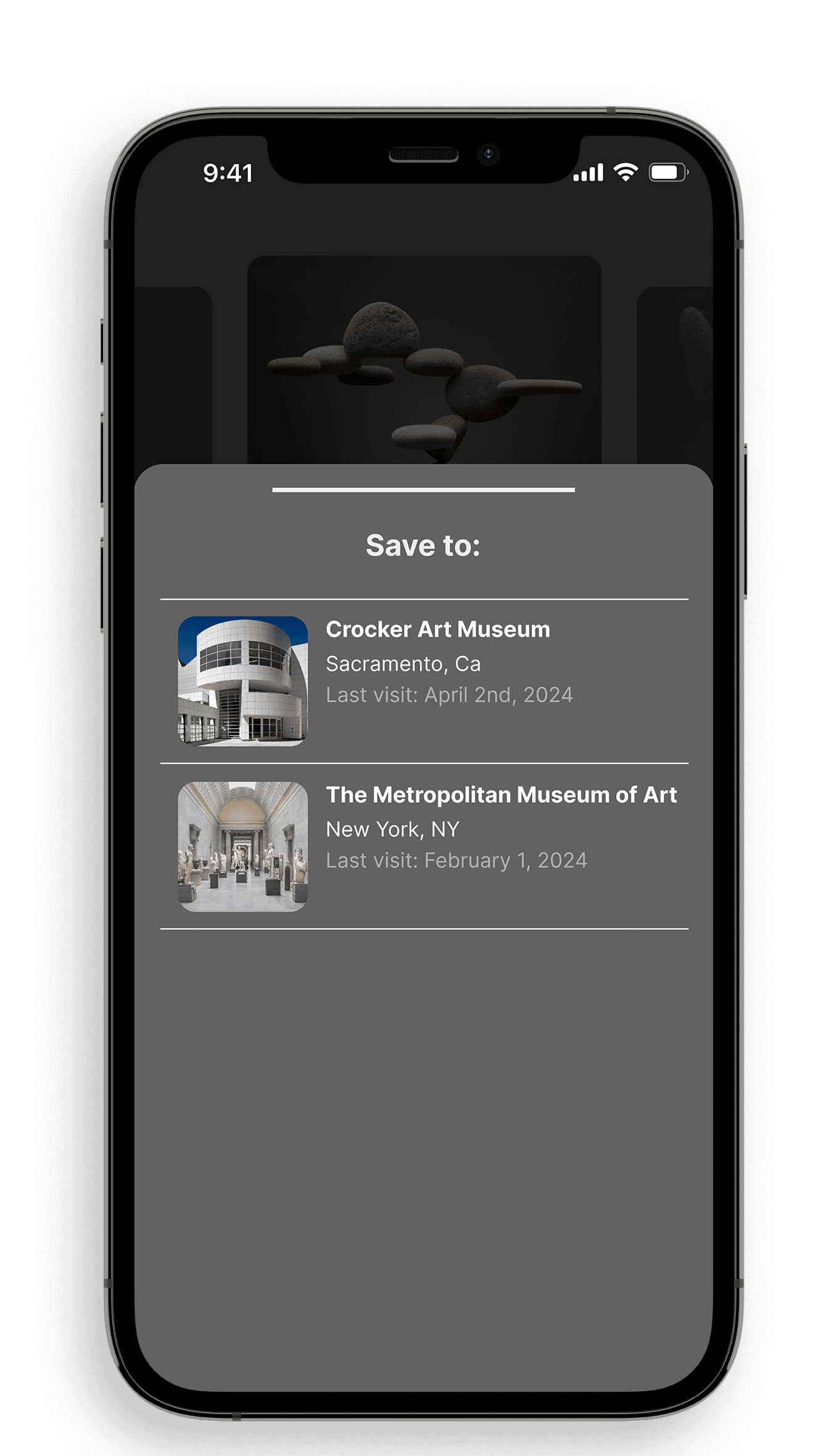
Users felt that everything that there was enough infromation on the screen
What didn't work
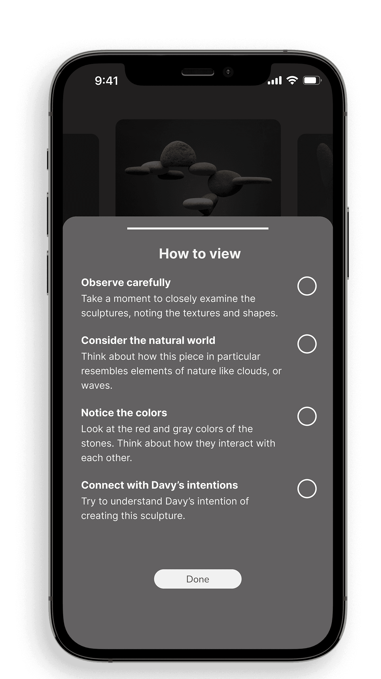
Problem: There was confusion as to why users had to check each step of the “how to view” section. However, they felt rewarded and satisfied they completed each step.
Solution: Add a line of copy to clarify the benefit of checking each stage of viewing
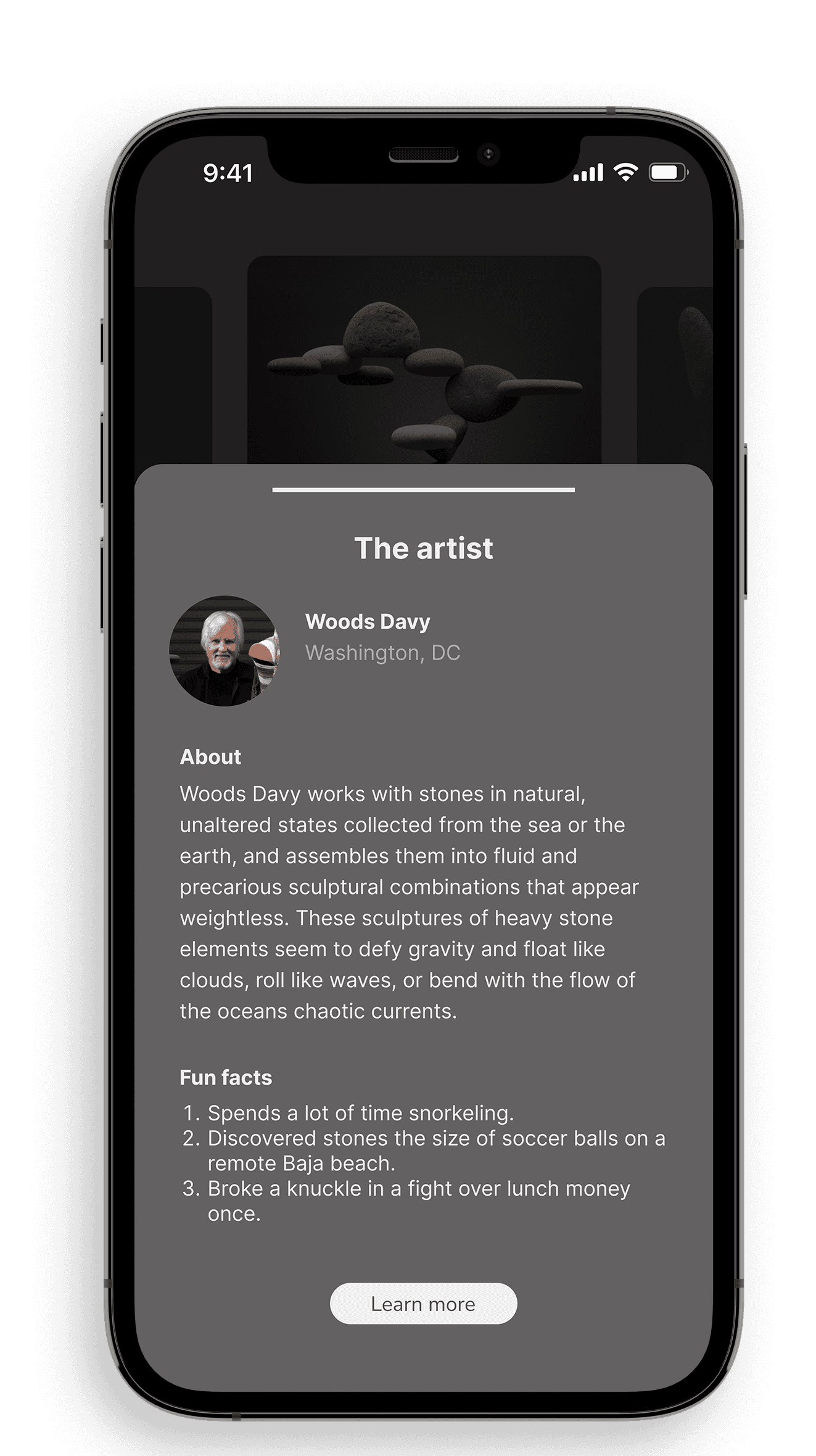
Problem: Users had confusion over the artist and artwork facts
There was confusion over the how to view and learn more buttons.
Solution: Fix UI and focus on copy to decrease confusion on actions.
How I would expand on the app
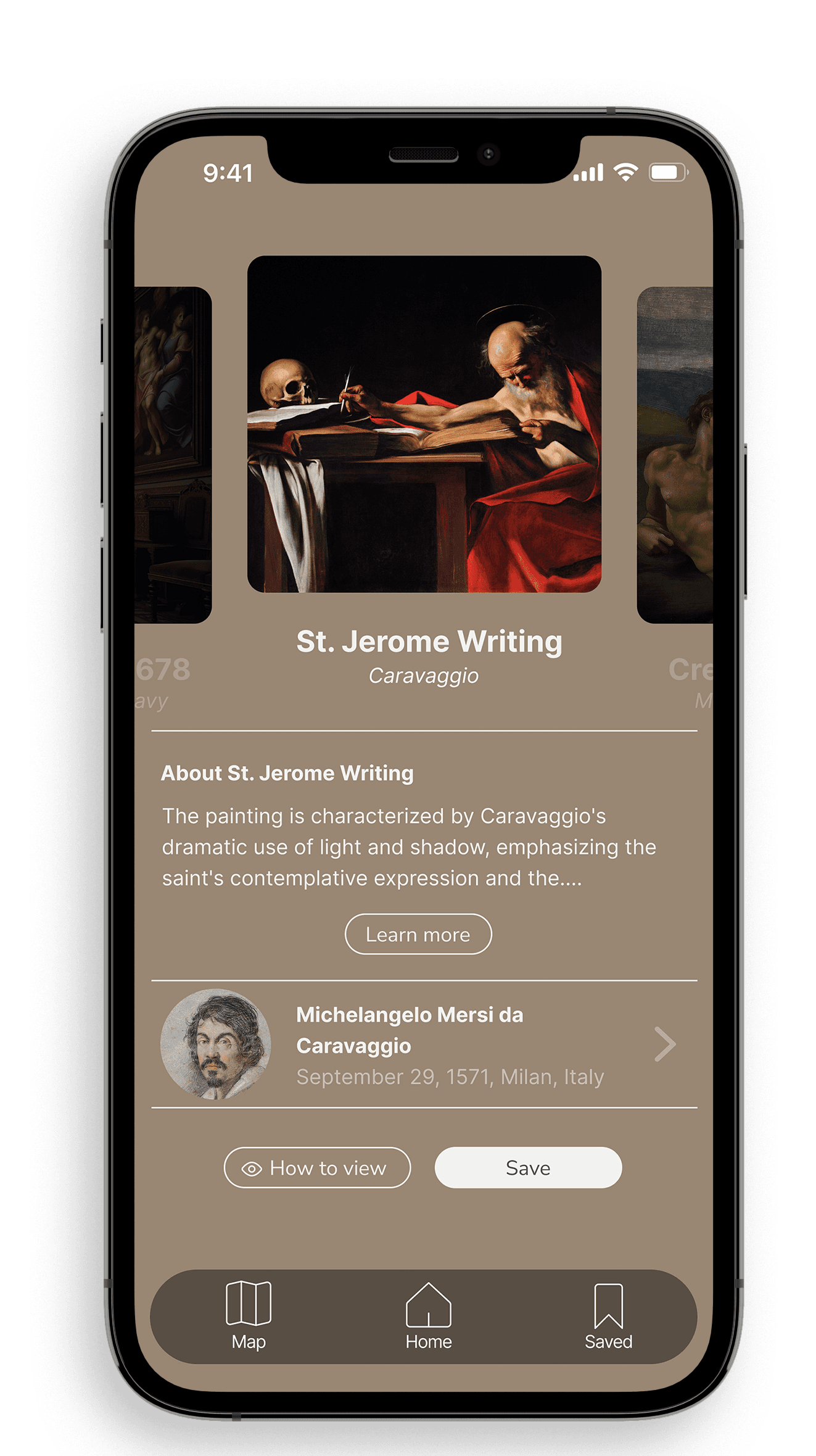
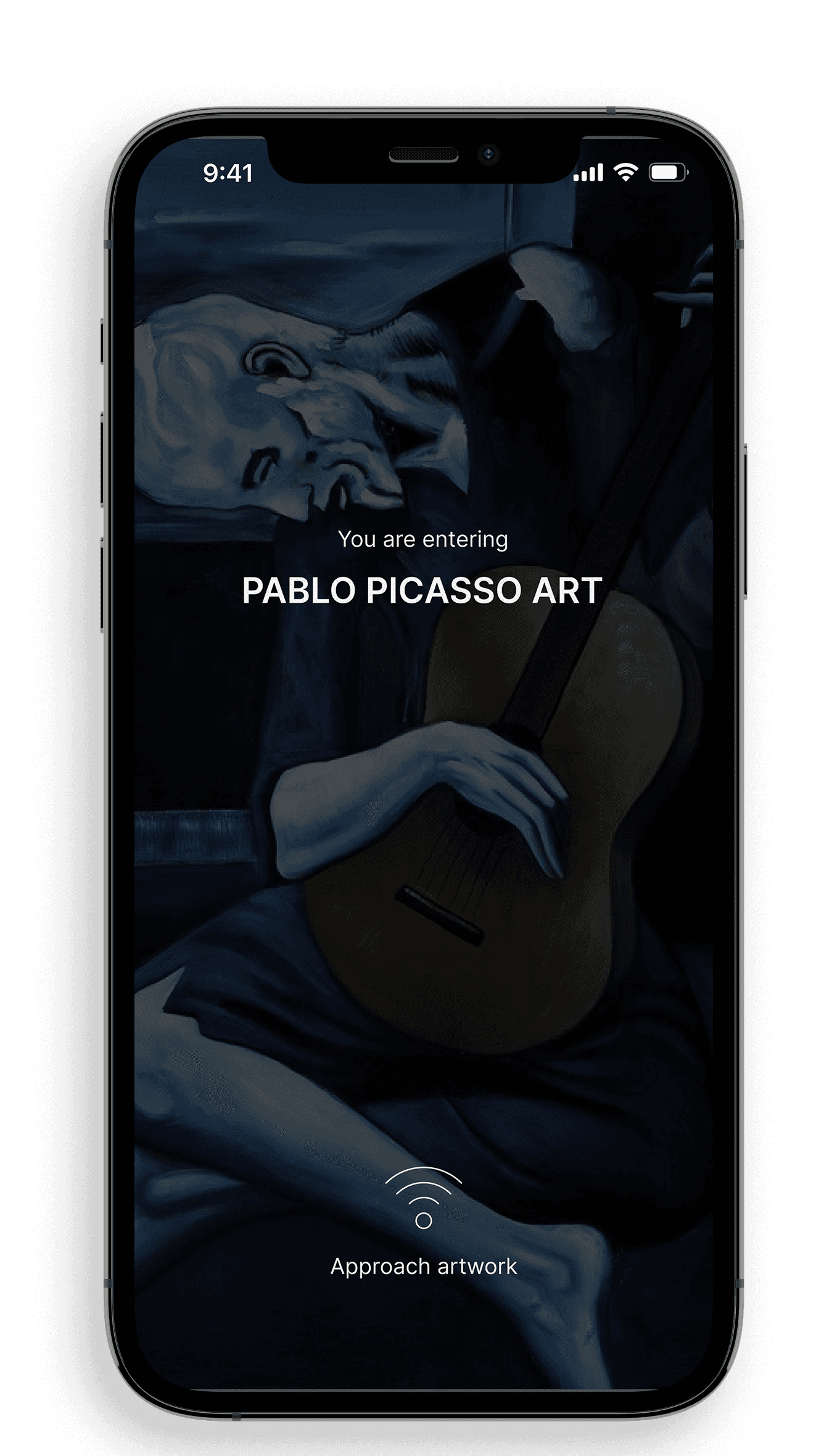
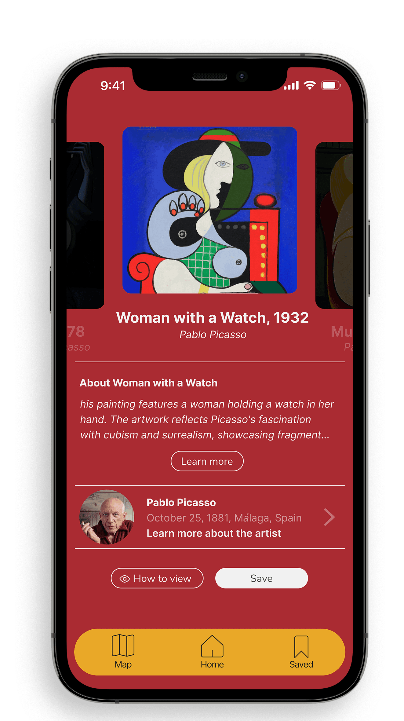
Given the time constraint, the entire idea for the product wasn’t shown. I’ve created a few mockups on how the app can be expanded upon. In these mockups, the UI would change to reflect the current exhibit the user is in. This solution further enhances the experience by merging the physical and digital spaces.
Entering a renaissance exhibit:
Entering a Pablo Picasso exhibit:
Next Steps
Increase engagement and business by offering a competitive/gamification features:
If this were a real company and not a prompt, I think there is an opportunity to bring more business to the company and museums in general. Psychological studies have shown that people have a competitive nature to them. If users can only save artwork at the museums they visit, itll make them want to visit more museums.
Integration of AI for wait times:
Nobody wants to be in a crowded exhibit. By integrating AI, the best route could be given to users to give everyone the best experiences and routes.
What I Learned:
You will fall in love with a design, but it may not be the best solution
Participants will have further questions on the entirety of the solutions, so always have answers. Participants wanted to know more about the product aside from the critical screens. They had a lot of questions. Luckily, I had the answer ready.
Smiles on participants faces when prototyping is very rewarding. Moderated usability testing in the real-life environment helped bring the participant into the real experience. As I walked along side of the participants and they felt the effects of the actual experience and it was satisfying to see them feel that.

