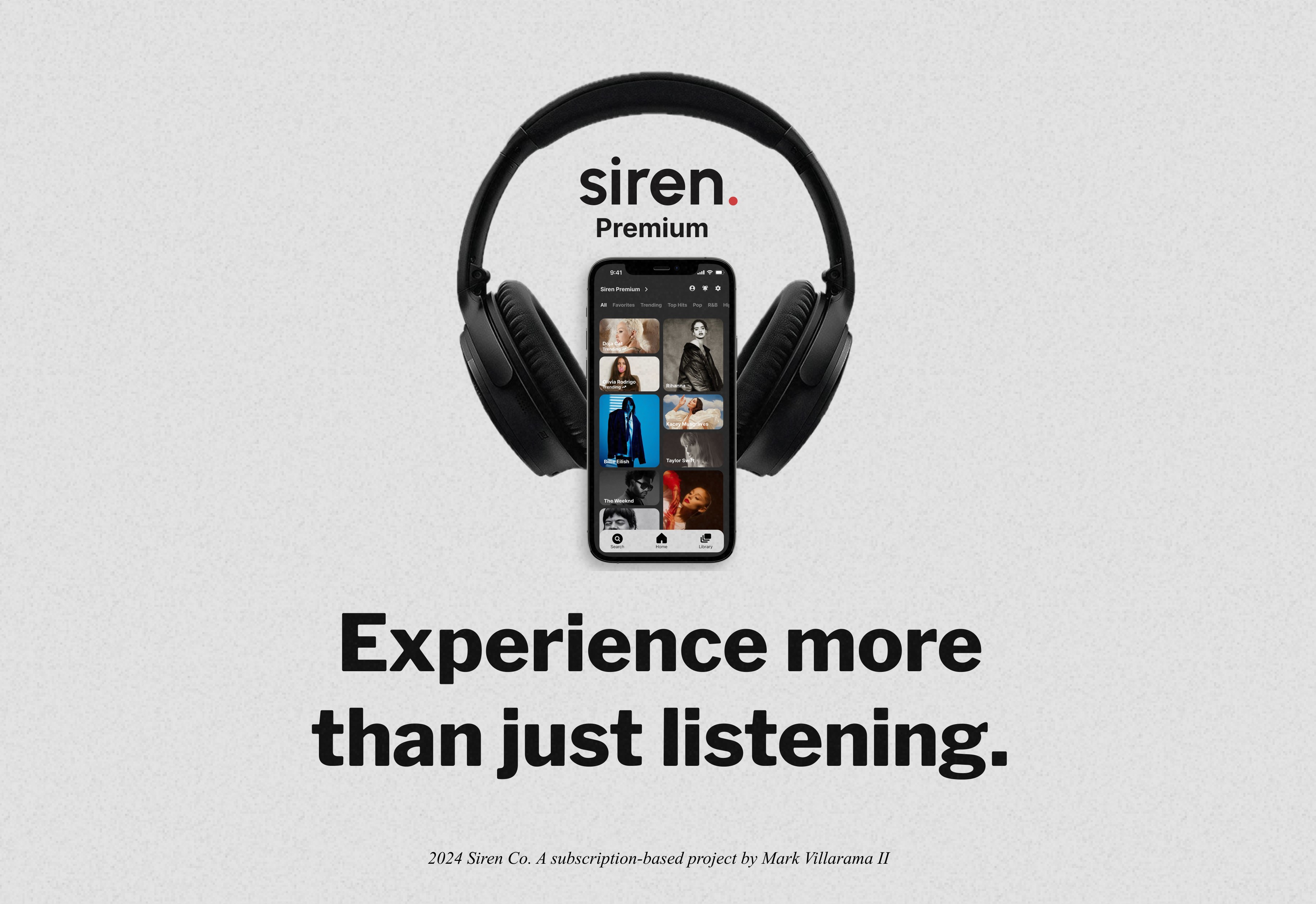
Siren.
A new subscription-based service that brings listeners closer to their favorite artists.
Overview
Siren, a music product and successful startup company, has established a loyal customer base over a two-year period. To improve satisfaction for their users and reach milestones for their business, they want to include a subscription-based model.
While this was a project for the bootcamp I was enrolled in, I treated Siren like a company, focusing on user wants and needs to craft a motivating and seamless subscription experience.
Timeline
1 Month
Role
Product Designer
Tools
Figma
Mockups (Wireframes)
Miro
The Problem
Siren’s upgraded experience does not exist, therefore they need a subscription flow for new and current users that encourages them to subscribe to a premium version and retain their subscription after upgrading.
The Solution
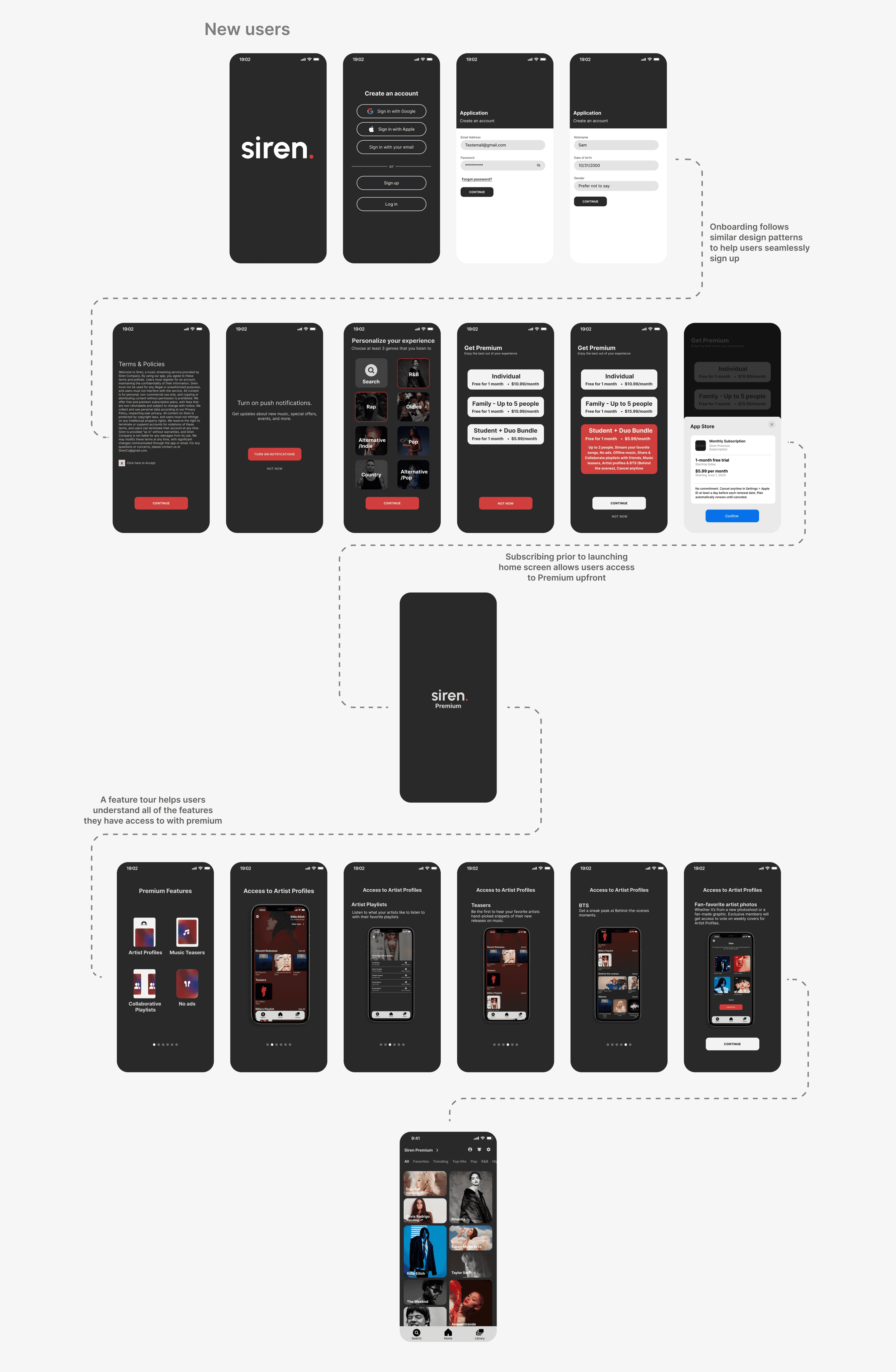
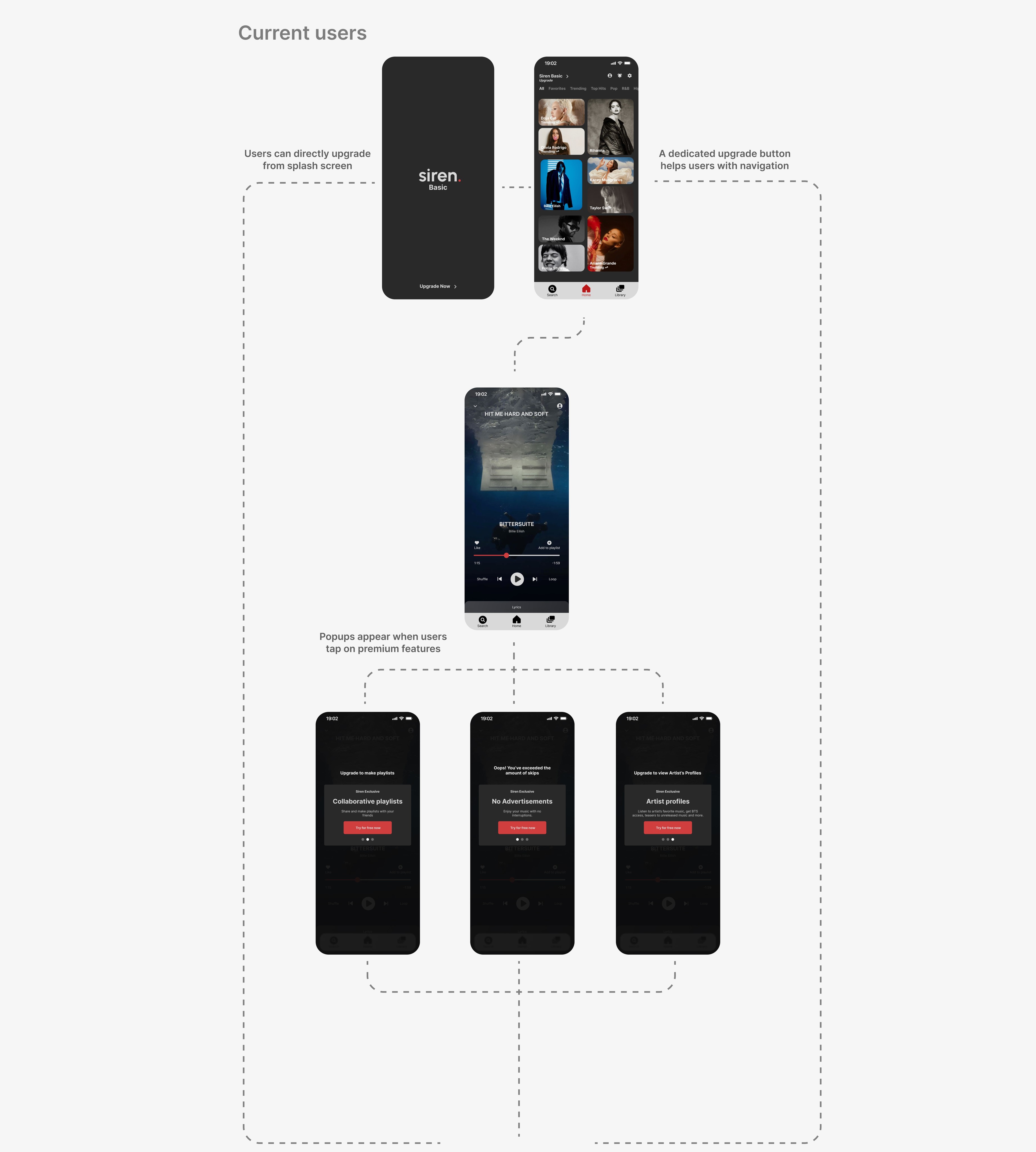
Curate a seamless and engaging subscription flow for new users in onboarding and multiple entry points for current users, while staying true to the features in the upgraded experience.

The Research
Survey
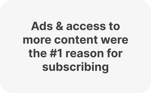
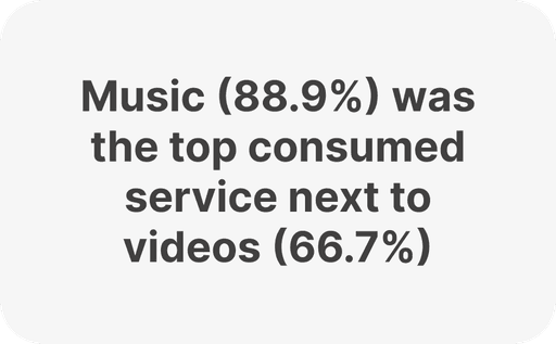
The survey helped me gather insights regarding general streaming and guide the questions that were asked during interviews.
Secondary Research
Reading through scholarly and media articles aided my discovery of industry trends and user behavior regarding product subscriptions and cancellations.
Consumers want a great end-to-end experience and only feel inclined to subscribe due to tangible benefits such as lower costs or increased personalization
Recommendation, and positive online reviews influence users to subscribe
Consumers are quick to cancel subscriptions that don’t deliver a good experience
Consumers subscribe due to convenience
Exclusive or distinctive content can increase readers’ perception of product value
68% say they feel loyal to brands they have subscriptions to
Gen Z and Millenials are inclined to try new subscriptions
Interviews
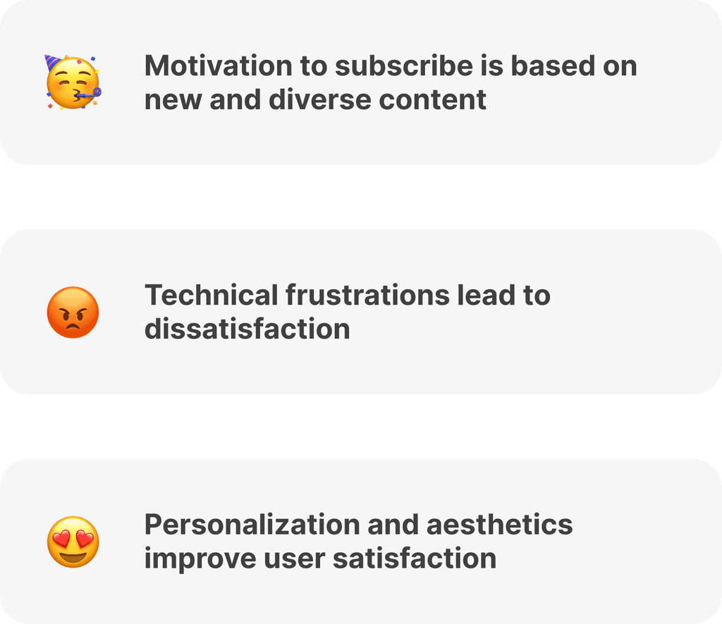
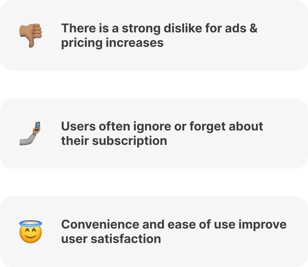
Learning about user’s frustrations, needs, and behaviors allowed me to uncover insights that weren’t addressed in secondary research.
Personas
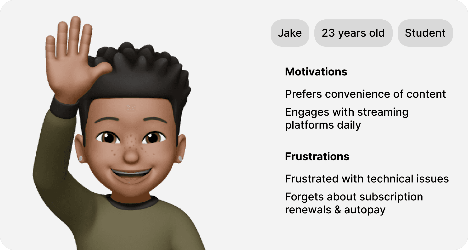
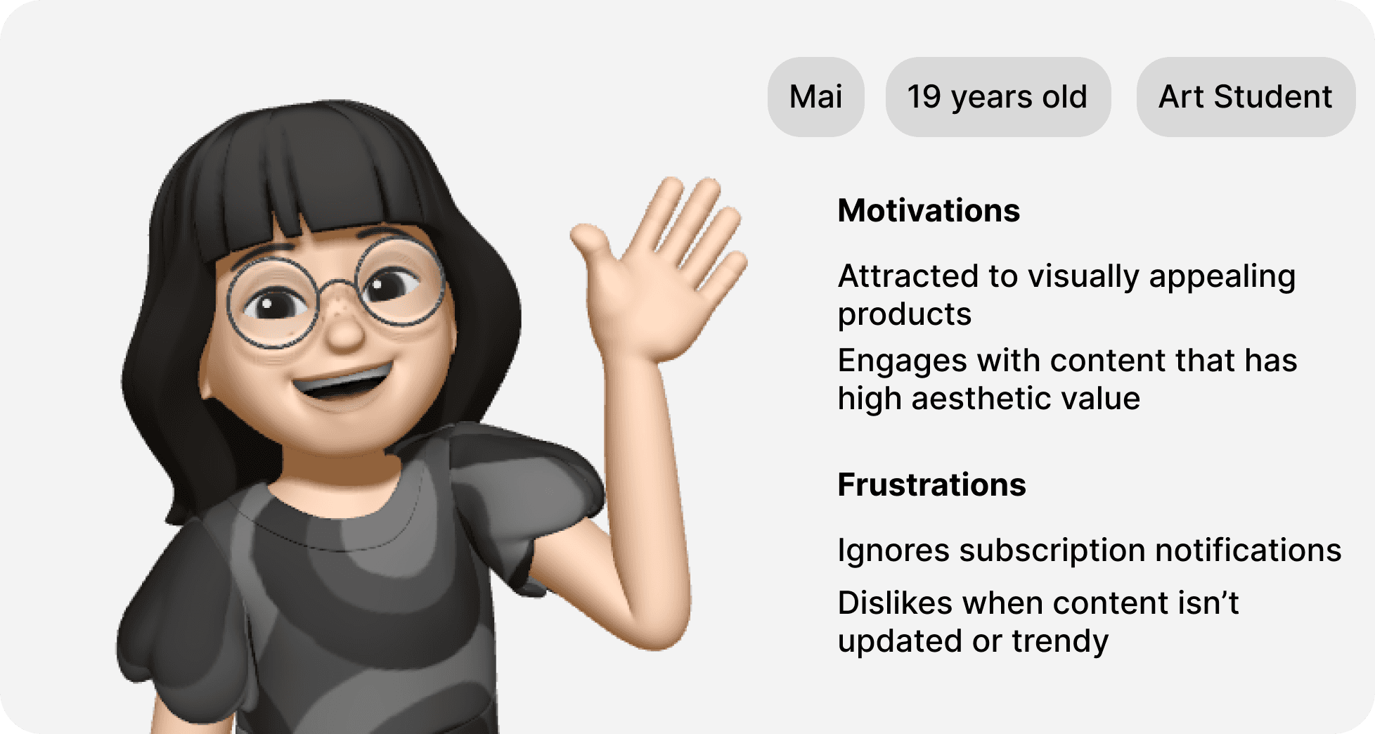
To gain a clearer perspective on who I was designing for, I created Mai and Jake from the insights and demographics in previous interviews. I revisited these personas throughout various stages of my design process.
Competitive Analysis
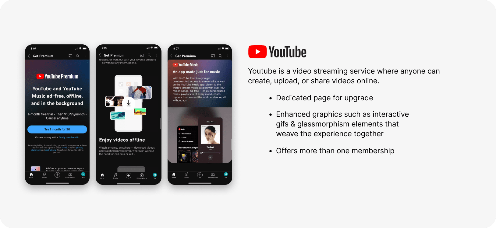
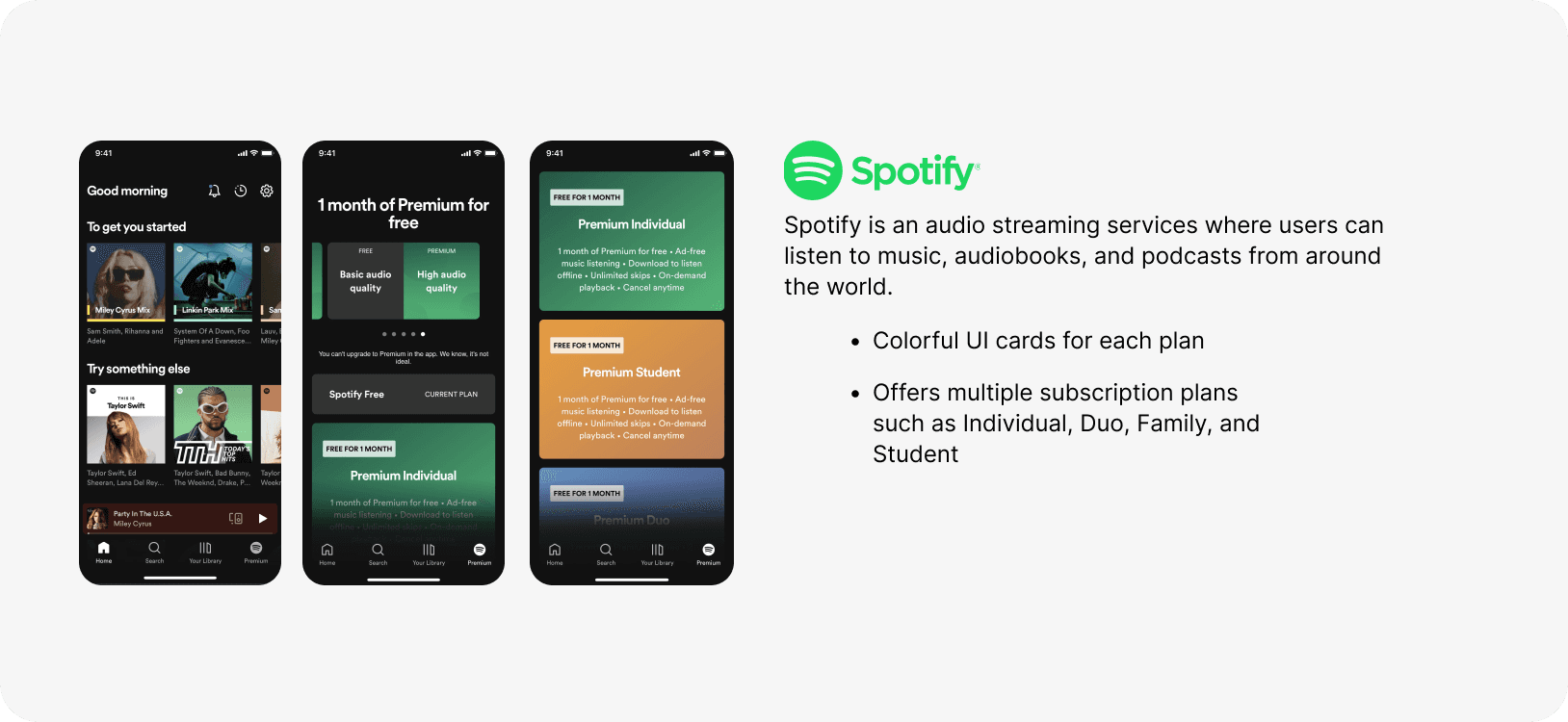
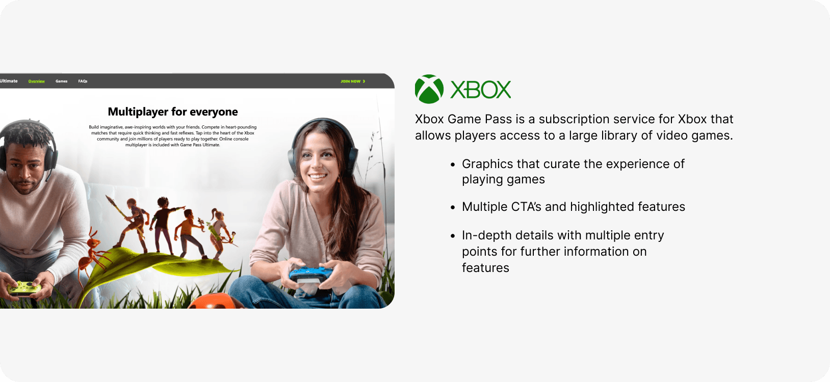
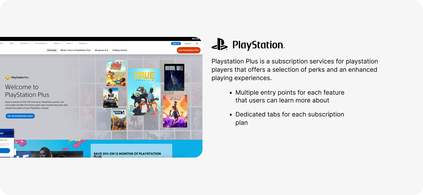
Studying what Siren’s top competitors were successful at helped keep up trends and was the starting point for feature analyzation.
The Design
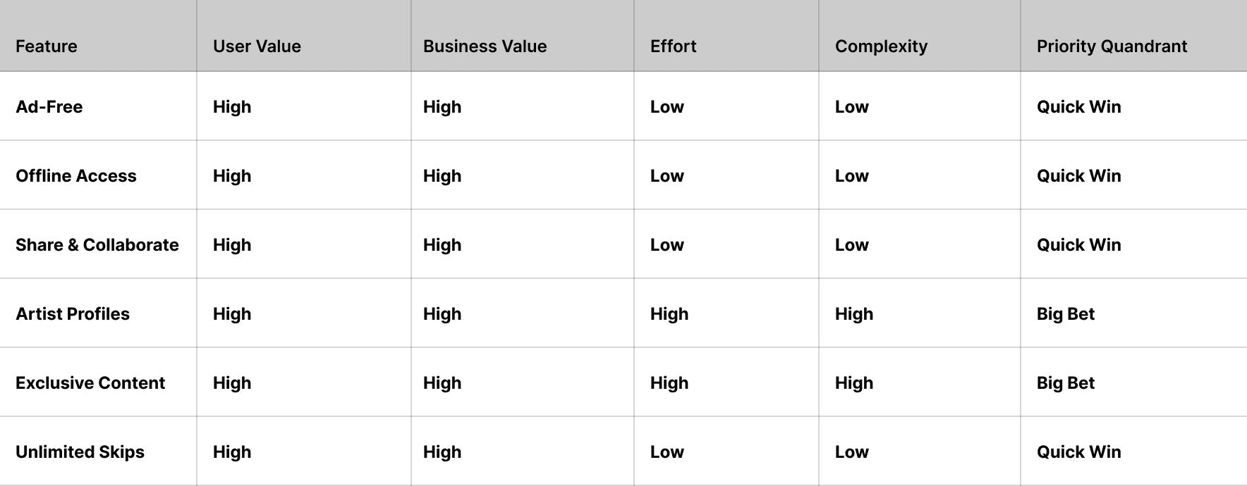
Feature Prioritization Matrix
Since the premium subscription was new and currently lacked features, a feature prioritization matrix, in addition to prior research, was made to determine the essential features needed to be successful.
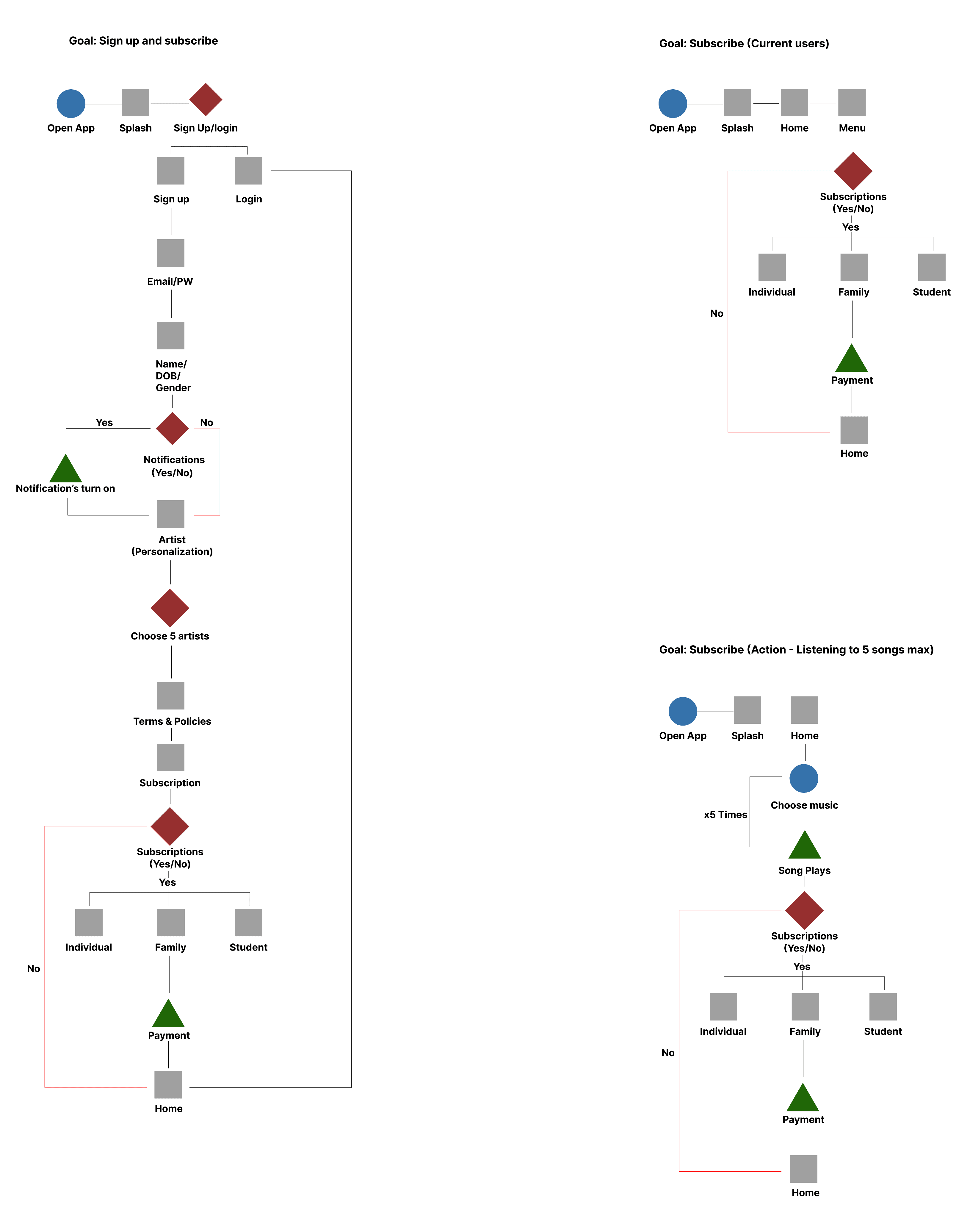
Userflows
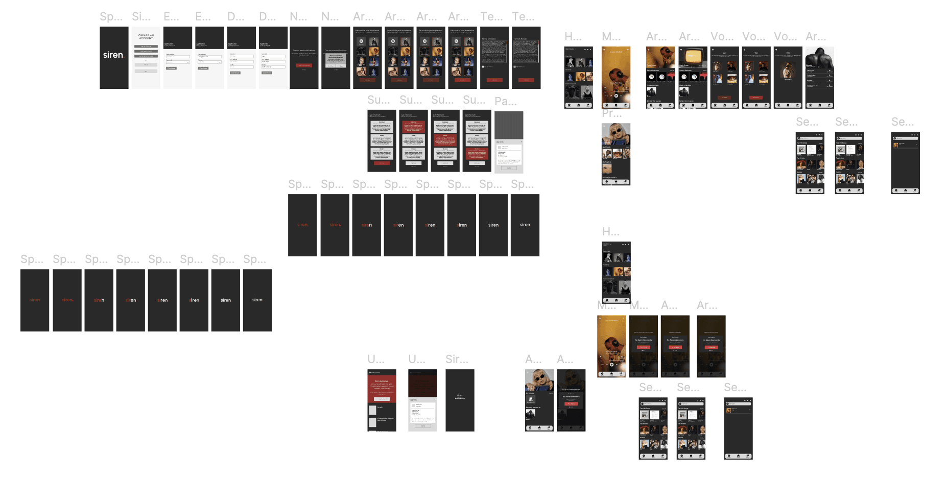
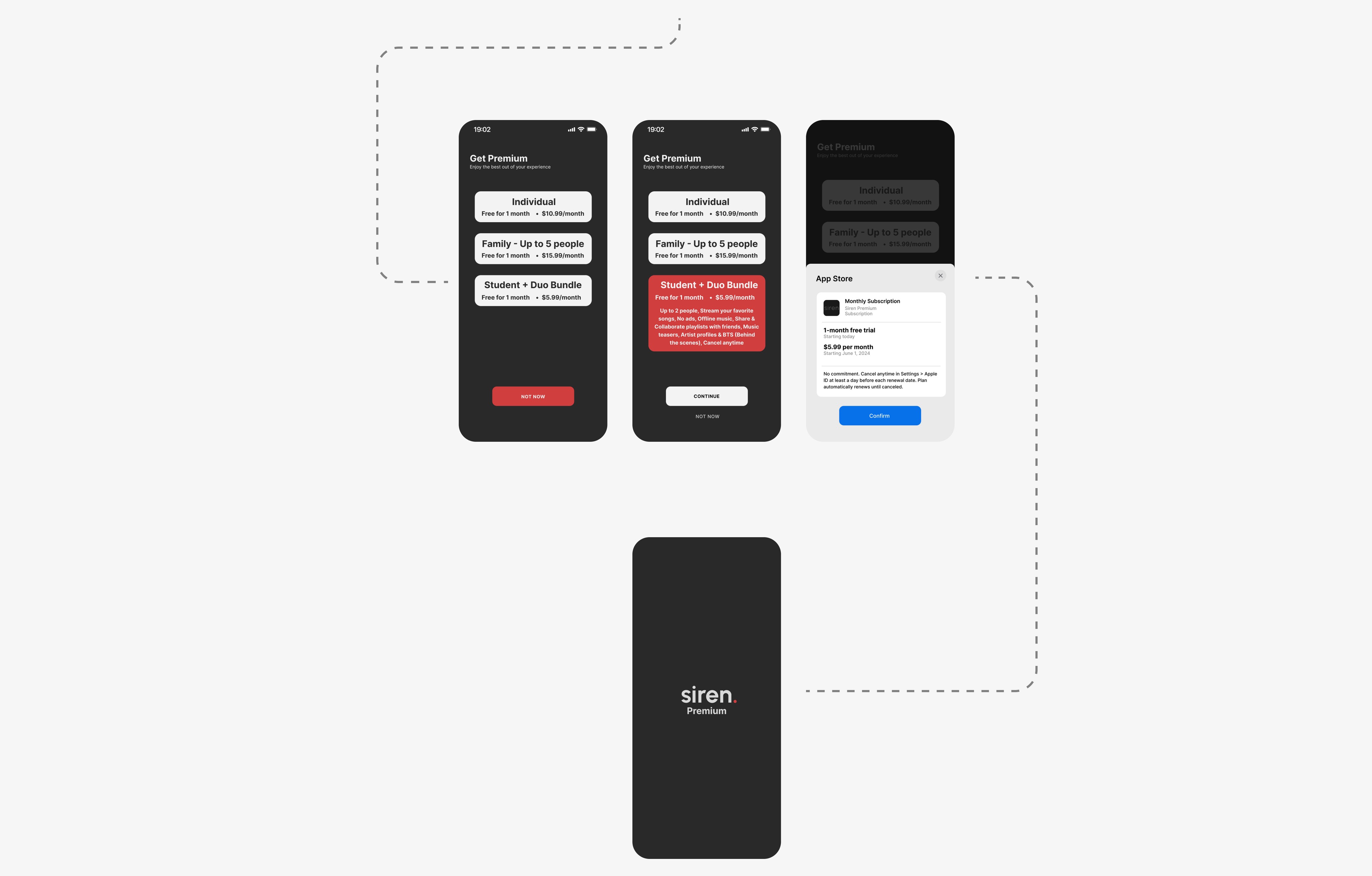
Multiple user flows were essential to help guide the flow for subscription during onboarding for new users and determine where the blocks should be placed for features that current unsubscribed users wouldn’t have access to.
Crazy Eights Sketch
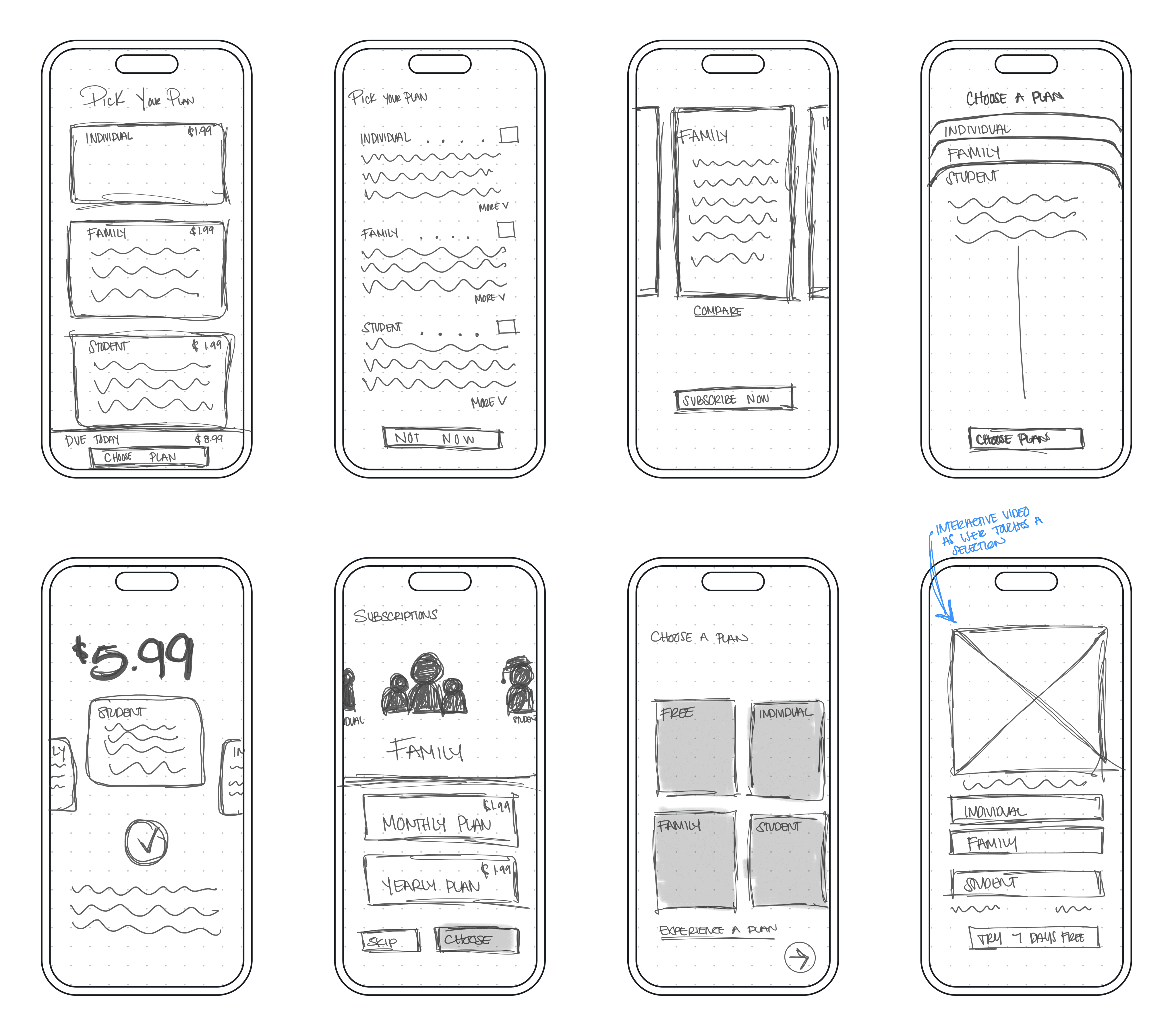
To prevent the creation of one solution, I used the Crazy Eights technique to explore different approaches and flows that users would likely engage with. In addition, it helped guide my overall design decisions for the entirety of the product.
Style Guide
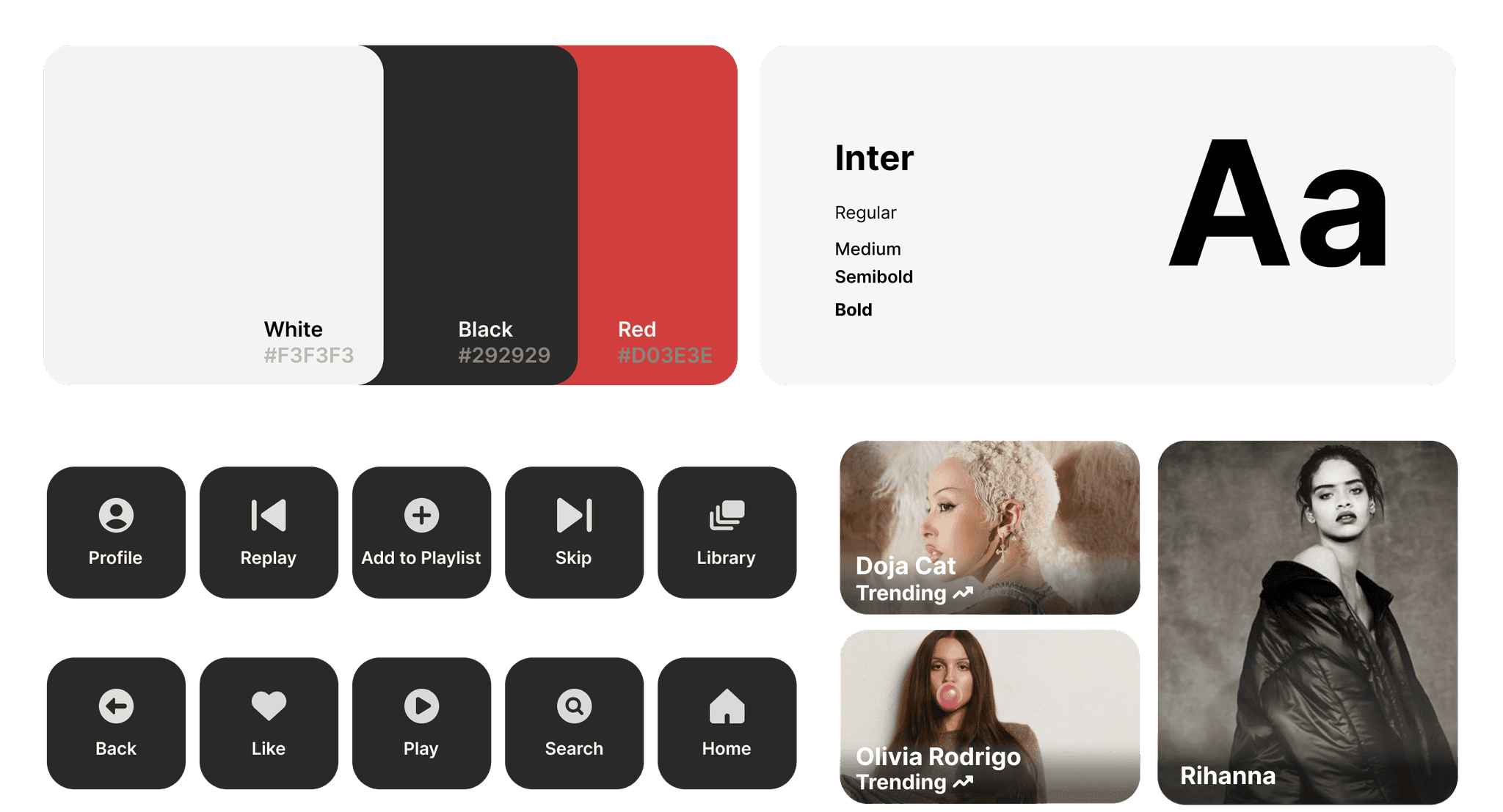
Given that Siren isn’t a real company and I was only provided low-fidelity wireframes, I created a style guide to assist me in creating the high-fidelity designs prior to testing.
Wireframes
Given the time constraints and the alignment with business and user goals, I opted for mid-fidelity wireframes. This approach not only saved time but also provided insights on both of the subscription flows and implementation of the premium features.
The Testing & Final Results
Test 01 Findings
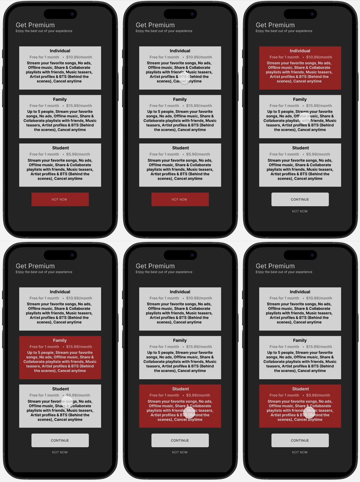
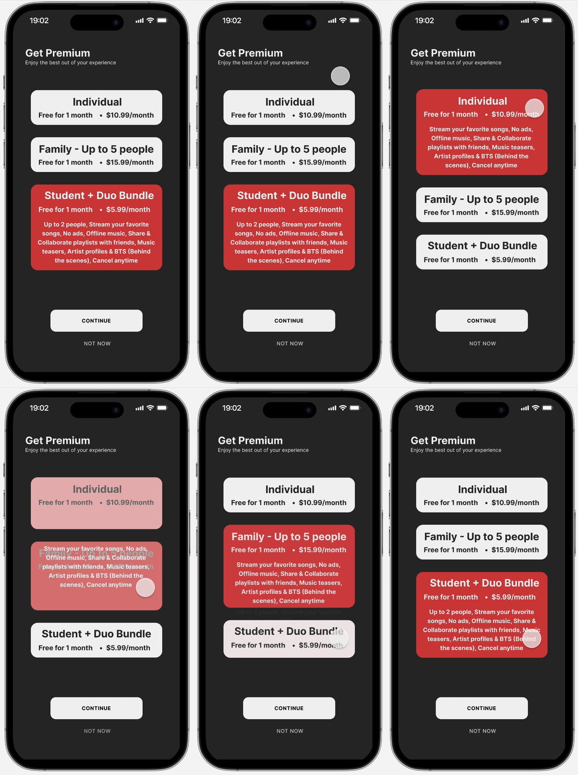
Problem: Subscription plans in onboarding (Individual, Family, Student) were not easily distinguishable
Solution: Increase UI so that users understand the benefit of each plan at a glance
Before
After
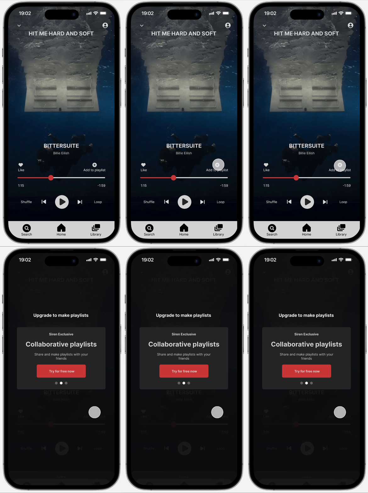
Problem: The “error message” and action block for the free subscription was skipped over and pop-up cards on the screen moved too fast to be read
Solution: Increase visual contrast for error message and allow users the freedom of swiping through the pop-cards.
Before

After
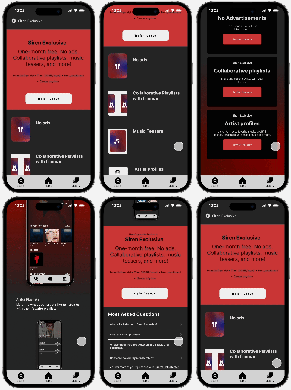
Problem: Users understood the upgrade screen, but their behavior depicted little engagement with it. Side note: Prototype could have been an issue for lack of engagement.
Solution: Enhance UI with engaging images that stay true to the product's purpose and company's brand.
Before
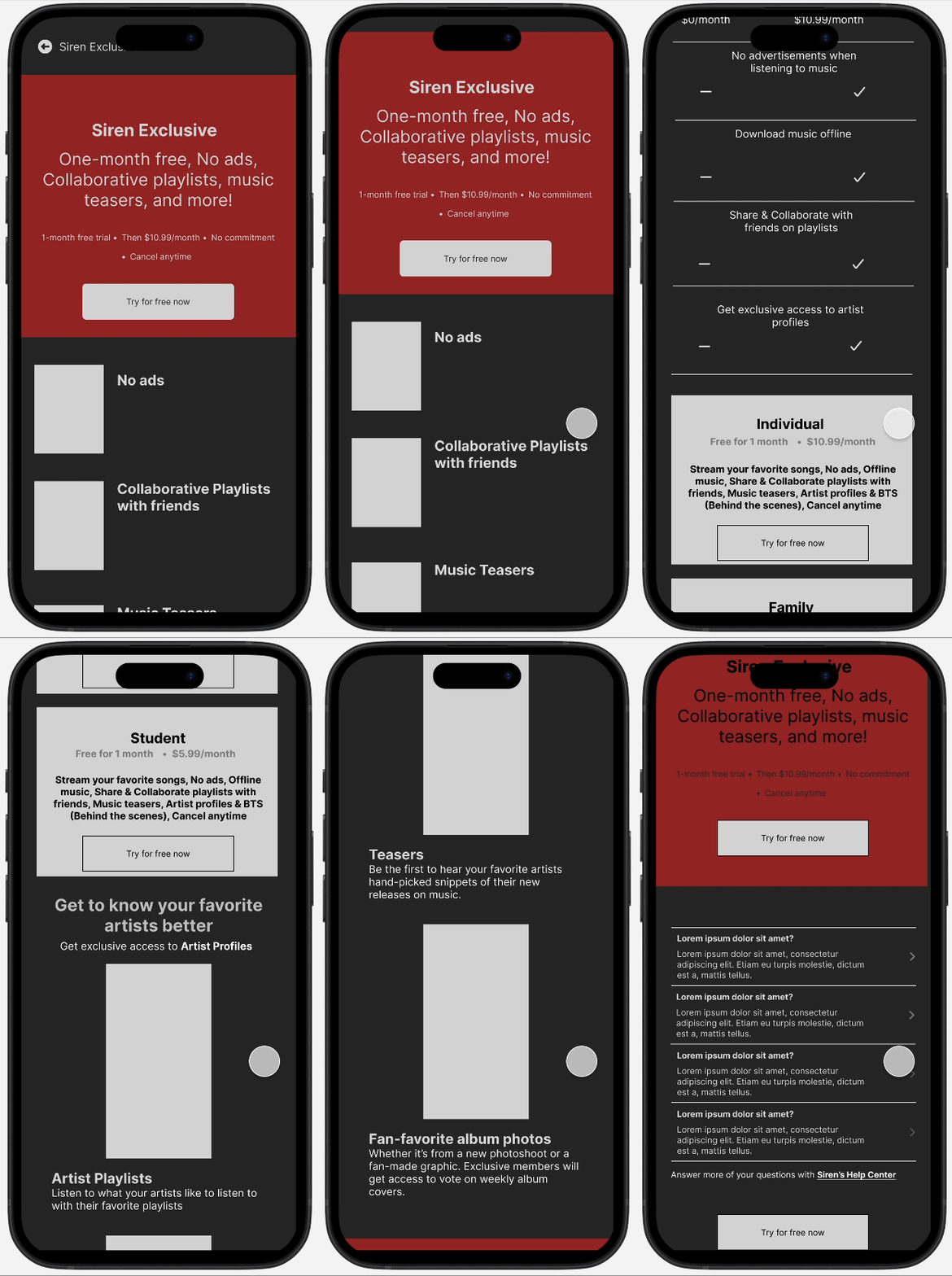
After
Test 02 Findings
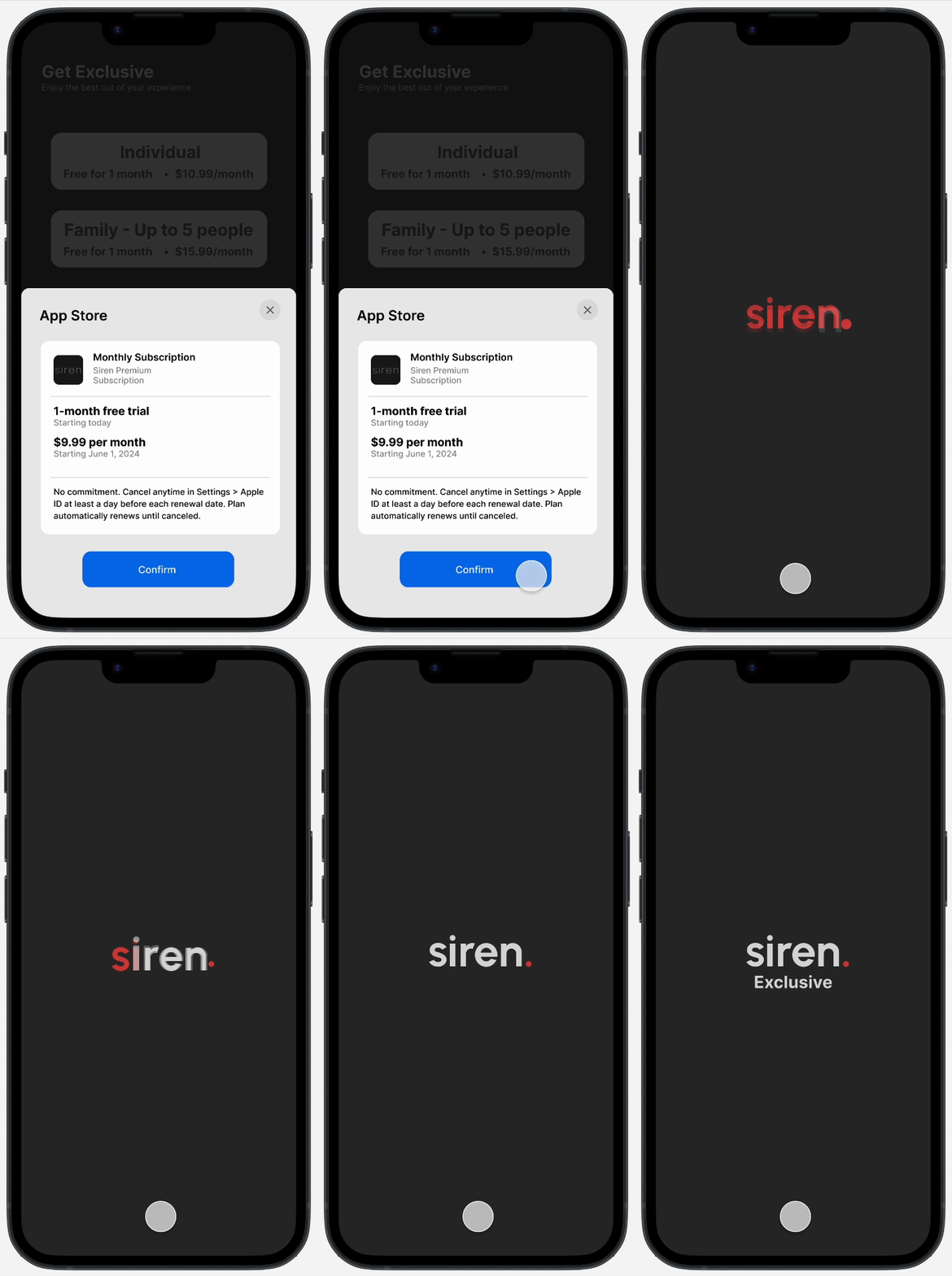
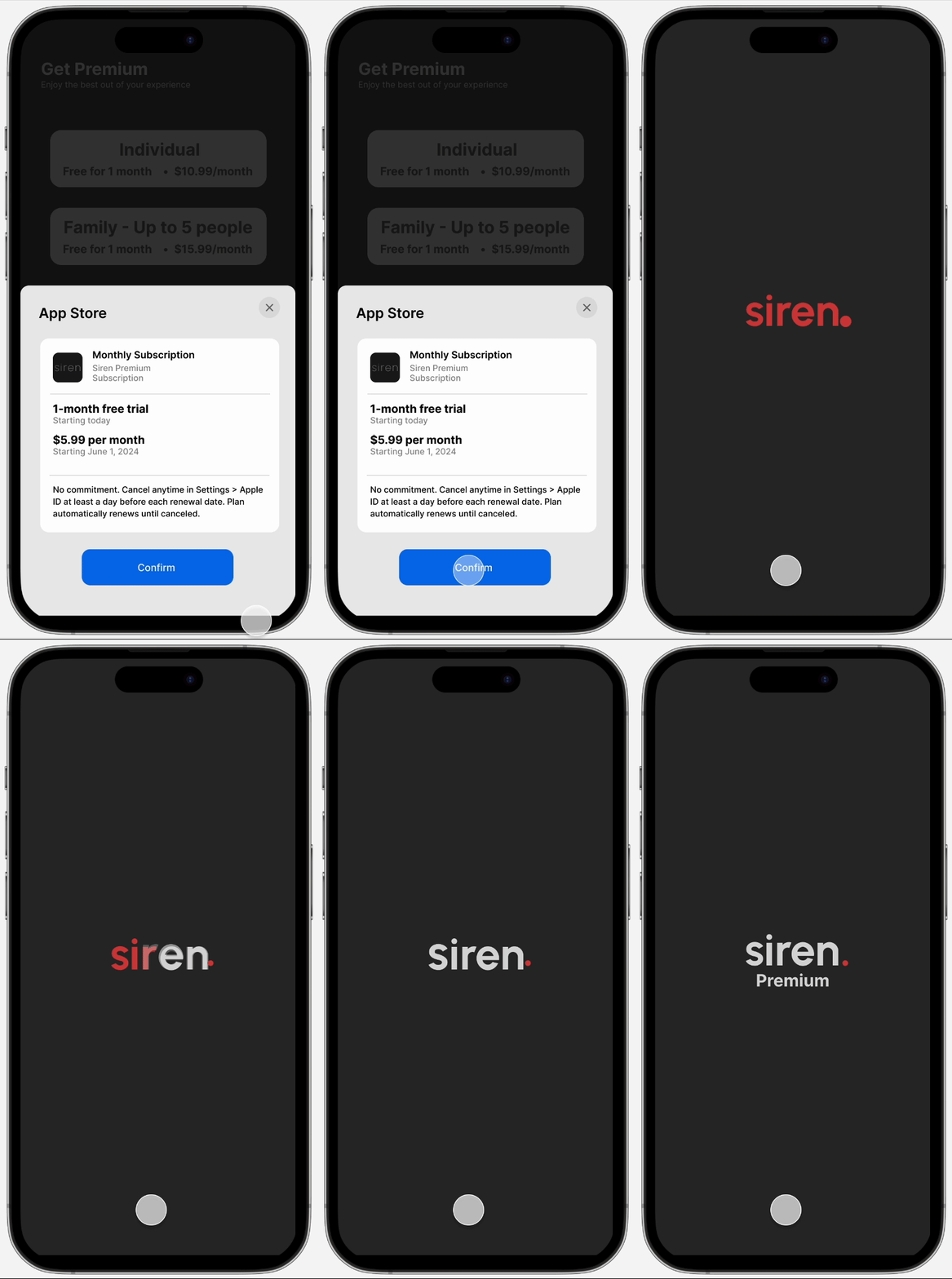
Problem: There was a misunderstanding on what “Exclusive” meant.
Solution: So following competitor trends and keeping in mind user mental models, Exclusive was changed to Premium.
Before
After
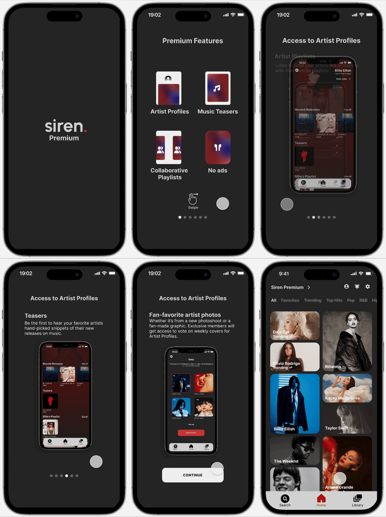
While analyzing the behavior of the participants and synthesizing the results, I came to the conclusion that users who went through entire set of features completed feature-related tasks more successfully.
Problem: Users who subscribed during onboarding didn’t understand premium features and were surprised to find information about them in the upgrade screen after they were tasked to downgrade and upgrade again
Solution: Add a set of screens that introduce premium features for new users during onboarding
Before

After
Problem: Users successfully completed downgrading their plan, however, all users clicked on settings to downgrade.
Solution: Given my time constraints, I created a button dedicated to downgrading, leaving room for me to understand successful tasks if I had to move it to the settings page.
Unsubscribing
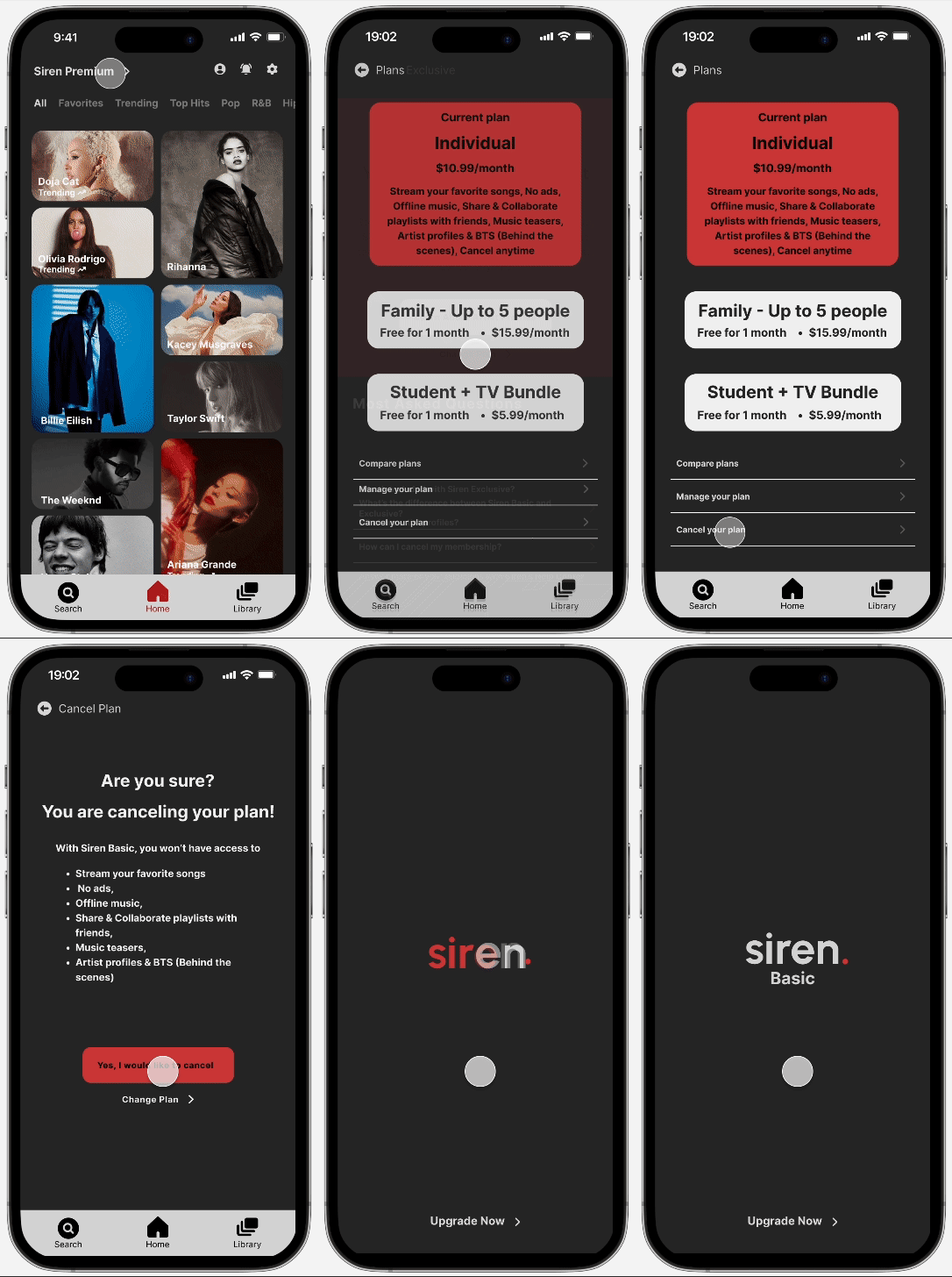
In order to ensure that subscribed users were able to access and get engagement for the premium subscription features, I tested the features to strengthen the overall objective.
During both tests, users continuously had issues with tasks regarding Artist Profiles such as locating the profile and voting for fan-picked images. To fix this issue, while also enhancing accessibility and engagement, I changed the overall design .
Before
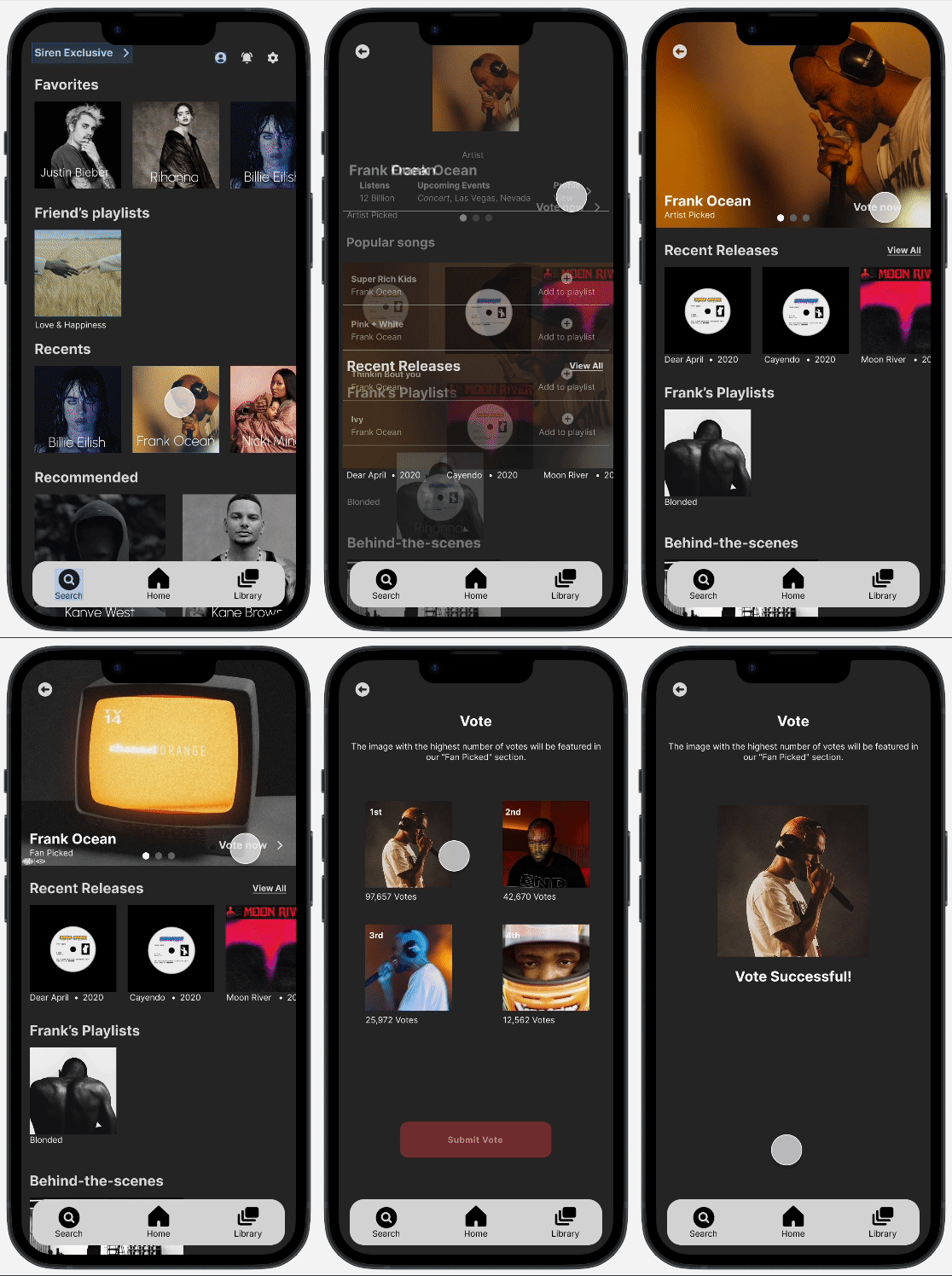
After

Next Steps
I would focus on KPI (Key Performance Indicators) to determine what’s successful and what needs work as well using the Net Promoter Score (NPS) and Customer Satisfaction Scale (CSAT) to understand the satisfaction for users.
What I learned
If there’s an entrance, there’s an exit. I realized after my first usability test, that I was focusing too much on the business goals and hadn’t created an option for users to change their current plan.
Sometimes users are unaware of their own needs.

